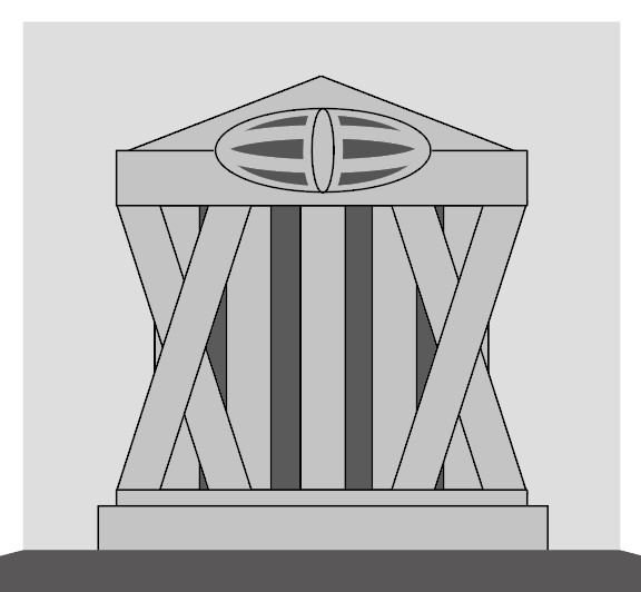
Brutalist design is all about bold hard edges, and blocky structures made of concrete. This style lasted from the 1950s to the 1970s but was eventually abandoned for its cold, unfit for human feel. This particular design caught my eye for its unusual top-heavy design resembling almost a tree, which relates back to the original idea of brutalist designs being strong.
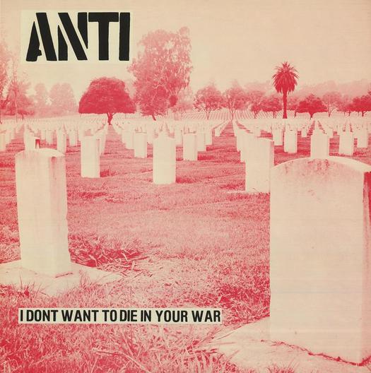
Anti, I Don’t Want to Die in Your War LP, New Underground, USA, 1982; Design: Dan Phillips, Ed Colver, Gary Kail. (2)
This Piece of Anti War design is very powerful. I chose it because unlike some other Punk/Anti art its message is clear, and it shouts it back at the viewer, which is what I believe all art in this style should be doing, and after all Art is all up to the interpretation of the viewer. The bright colour red being used here as a filter layer for the original image could be used to signify the blood of the fallen soldiers, or maybe even to promote feelings of anger or hate towards the governments behind the war both of which are the intended effects for art like this. The caption is also really powerful, “I DONT WANT TO DIE IN YOUR WAR” in block capitals, clearly showing it is not their war to fight, that people are needlessly dieing for it and it also brings in the personal element from the artist “I” showing this is intended as a message from them (anyone with these beliefs) to those in power.
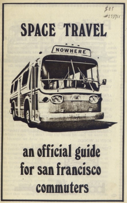
Situationist pamphlet by David Jacobs, USA, 1973. (3)
This piece by David Jacobs Is Part of the punk style of design, these designs are very much about going against the grain, whether its being anti-government or just against something in general, they display it with art. For example, this piece is potentially trying to say something about space travel going nowhere, as represented by this bus, or it could be a reference to other social issues happening at the time.
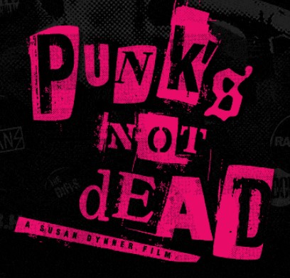
2006 Punk Is Not Dead film (4)
I Went with this movie cover art as my final example of the style as it uses one of my favourite elements of Punk styling in design, this being the lettering. This form of word formation is the mimicry of collage words where people take different letters from different magazines to form a different word, however, in digital form, this can’t be done but only mimicked creating this interesting collage effect. It can also be stated that the use of colour in this design references the backed-up anger and anti-establishment feelings that fueled a lot of the movement itself.
My Reinterpretations
Embracing the brutalist design of bold concrete blocks working together to make a strong structure, I created this mockup of a government building based partially on Greek architecture while also including solid diagonal elements for extra strength creating the second strongest shape, the triangle the first being the circle. I included the visual element at the height of the structure in order to both resemble the watchful eye of the government, leaning into the punk/anti-style and link to the internet as it resembles the base internet.
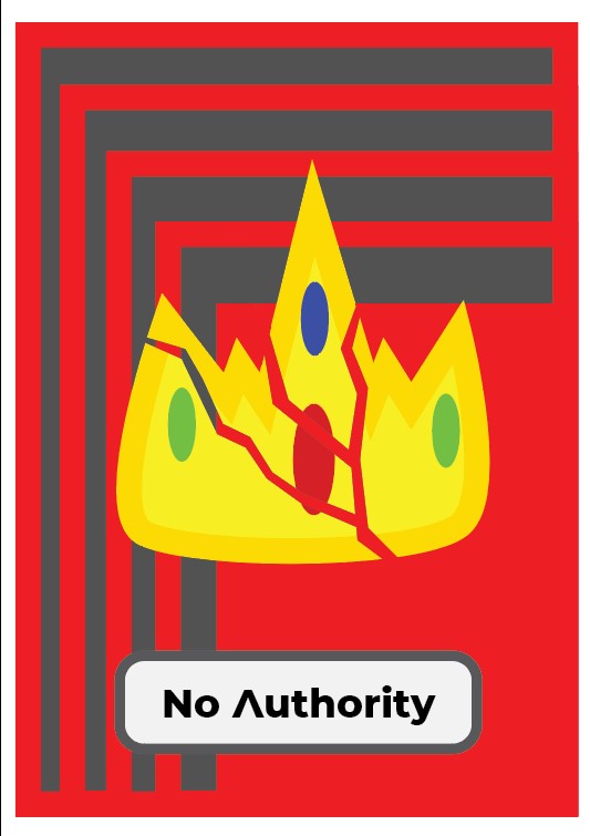
I really wanted to embrace the ‘going against the authority’ ideology associated with punk designs so for this interpretation I chose to make a comment on the royal family being old and no longer needed, holding very little actual power in modern society other than bringing in tourism revenue for the country. I used this bold red background with a declining in-size box effect to emphasise the reduction of the need for a monarchy as time passes, cracking the power of ‘the crown’.
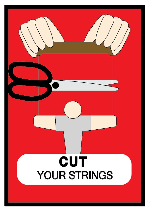
Moving on to Punk Design I decided to explore the minimalist Punk aesthetic for the poster design, closely basing it on the original bus to nowhere piece but reflecting a different message about escaping from under people’s control, a message commonly found in Punk media, finding freedom from those in power.
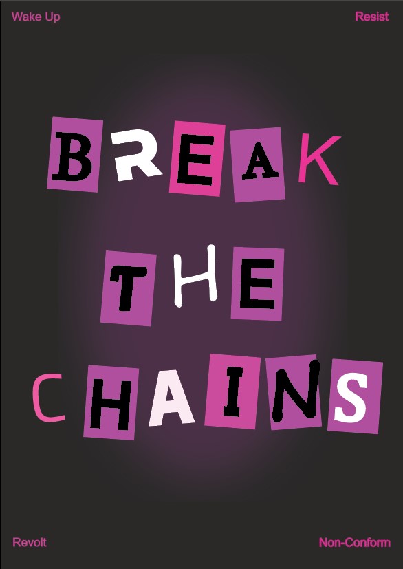
For my final Punk Design reflection, I wanted to use the collage text effect. For this particular design, I went with the general “break the chains” message as it fits the punk aesthetic along with the bold pink lettering style to promote the contrast between what’s considered normal when compared to punk design.
References
Hohenadel, K, La Jolla, Barry Winiker. (2022) What is Brutalism?, The Spruce. Available at: https://www.thespruce.com/what-is-brutalism-4796578 (Accessed: 08 May 2023).
Budrick, C. (2019) Punk for a day: Graphic design history and the punk aesthetic, PRINT Magazine. Available at: https://www.printmag.com/culturally-related-design/punk-aesthetic-graphic-design/ (Accessed: 09 May 2023).
Poynor, R. (2016) The art of punk and the punk aesthetic, Design Observer. Available at: https://designobserver.com/feature/the-art-of-punk-and-the-punk-aesthetic/36708/ (Accessed: 09 May 2023).
Dynmer, S. (2006) Punk Is Not Dead, Punk is not Dead the movie – Official Site. Available at: https://www.punksnotdeadthemovie.com/ (Accessed: 10 May 2023).