Minimalist design and Zaha Hadid
When researching Minimalism I came across the works of Christian Jackson who does Fairytale Cover Art in a minimal version. This Piece was made for Rapunzel and used the minimalist style of simple colours and shapes to resemble something recognisable, in this case, it’s the iconic hair from the story. He does this in a rough textured way which in this case really works for promoting the idea of hair while also making the hair more 3d by using the texture to show shadow/highlights. His backgrounds are also mainly solid toned-down colours for example the very desaturated purple here. He then applies a grainy texture/effect around the edges to draw the eye towards the focal point of the image.
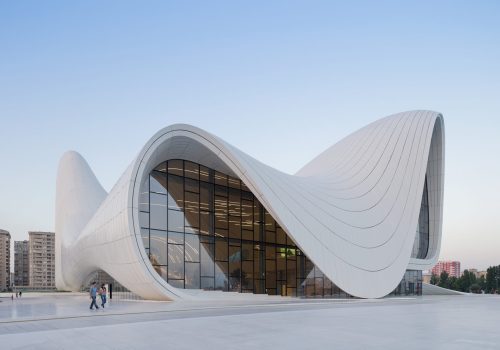
The other minimalist artist I researched was Zara Hadid the architect, her buildings are known for their minimalist very organic flowing lines and curved edges. In this building she uses a, almost wavelike design which creates a very natural shape countering the stereotypical square/rectangular buildings you see everywhere in modern architecture. She also uses these beautiful intermittent window panes on the design mimicking the randomness of waves.
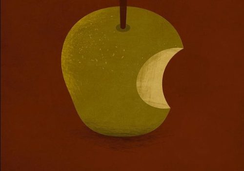
Here we see again the works of Christian Jackson Showing his use of texture to promote 3d Visuals in simple shapes making for a very detailed minimal approach which is why I find his work so interesting, it contrasts the idea that minimalism has to lack all forms of detail. In this piece he uses the background grain to create a shadow for the apple, using a desaturated red background which could be interpreted as blood red indicating the sinister notion behind the apple in the story. He also includes the texture on the apple itself colouring the texture with the opposite for each part of the apple (the inside is highlighted in the colour of the outside and visa versa) which illustrates the idea that the apple is starting to go bad while also showing its 3 dimensions.
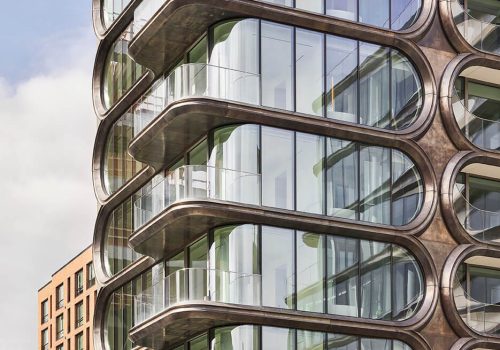
This Building is also a Zara Hadid design, when researching this I began to realise she works with very curved lines in her work, flowing rather than having any hard edges. As we can see in this design she went for an almost modular effect for the different apartment windows in this building, all repeating one after another, on that note it is also to be said repetition and simple one-line edges are a feature of minimalist design despite the complexities of architectural buildings.
My Reinterpretations
For my redesign, I decided to go more modern than fairytale books recreating the Thor Ragnarok Poster in the minimalist style instead. Personally, Minimalism has always been a favourite of mine so combining it with a movie I love makes this a more personal poster design for me. I went with a bold black-on-yellow contrast as the combination is always appealing, keeping the elements I included minimal while still representing what the movie is based around in just 2 simple elements.
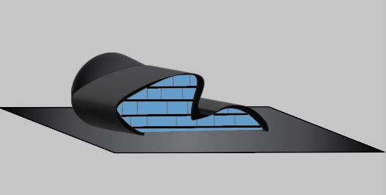
To try and reinterpret Zara Hadids minimalist work i had to venture into the realm of 3D. Attempting to create a very minimalist building in her style I went with one flowing roofline and one big window with a larger section at the back, I did the section at the back as without it the building seemed too minimal, which although in this context may be a good thing there can be too much of a good thing in which case the design becomes simple.
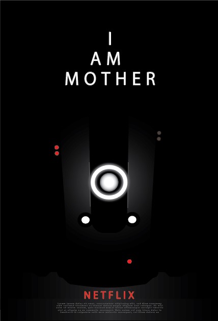
For my Second re-interpretation, I did the same idea using a minimalist design to create a poster for a film, this one being a recent watch for me, it was fresh in my mind due to its good story and impressive visuals, especially the robot’s design. To Minimalise the film poster I used the robot’s basic elements (The shape and lights) in order to replicate a dark environment where all that could be seen is the lights, giving this very Omonous effect which matches the movie itself, as well as using minimal elements to get this effect
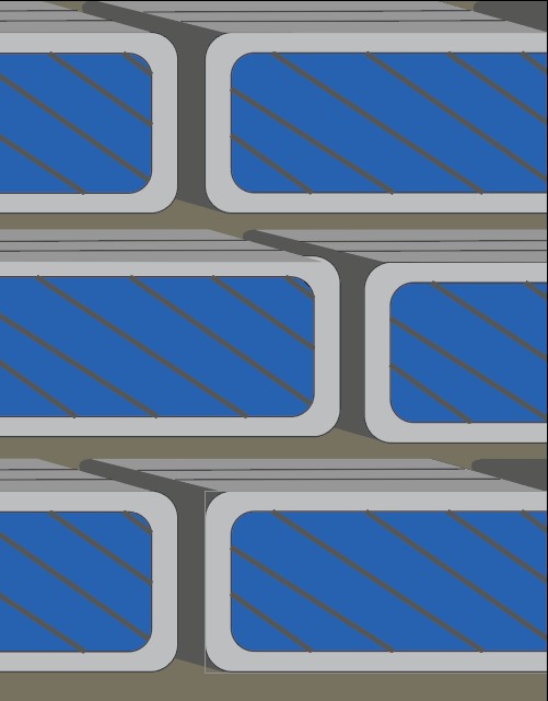
For the final piece, I Incorporated Minimal design into Pod-like rooms that I imagine would be on the side of a residential building, this type of design saves space within the building for other uses/rooms. This uses minimal design In a similar way to Zara Hadid’s work where she extends the building out with repeating simple shapes, as shown in my design the pods repeat in an intermittent design reinforcing the minimalist design ideologies.
References
- Jackson, C. (no date) Christian Jackson digital art for sale, Christian Jackson Digital Art. Available at: https://christian-jackson.pixels.com/art/digital+art (Accessed: 03 May 2023).
Baan, I. (2012) Zaha Hadid architects, Heydar Aliyev Centre . Available at: https://www.zaha-hadid.com/architecture/heydar-aliyev-centre/ (Accessed: 21 April 2023).
- Hufton+Crow (2012) Zaha Hadid architects, 520 West 28th street. Available at: https://www.zaha-hadid.com/design/520-west-28th-street/ (Accessed: 21 April 2023).

