Wireframes and mock-ups
One of the most crucial parts of the design process is the wireframing and mockups stage, this is because they allow designers to test out the look of different layouts and designs without fully committing to implementing it onto the real website. This is especially important for a website like the Freedom Festival which is all about different artists and their points of view. This is something that can only be achieved in wireframing and mockups where it is easy to take new ideas and implement them without needing to develop the idea fully.
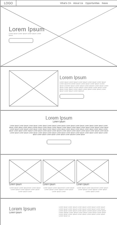
Wireframe
Wireframes are the building blocks for a good layout, essentially it is the bare minimum amount of design in order to let a designer focus on the layout of the page and how it should be shaped. At this stage, graphics might not even be developed yet it allows creative freedom for the layout and helps to visualise how blocks of text could work on the page, allowing the designer to tackle what information is more important in the hierarchy. This is often developed in tools like Figma and Adobe XD like this example I developed in XD. I decided to focus on a traditional layout opting to differentiate in the graphics instead as layouts like these are tried and true to be effective communicators of information. This matches the goal of the website which is to distribute information about the Freedom Festival to viewers and get them engaged in the event. When it comes to any layout one important element often forgot about is consistency if an element appears one way in one page it should retain the same layout and design in the other if used again. The purpose of this is to make sure the website feels like the same website when the user travels across the pages in order to not look like they’ve moved onto a new website with each dive into the navigation as this can deter some users from continuing on the website. The consistency creates a more trustworthy recognisable image for the website.
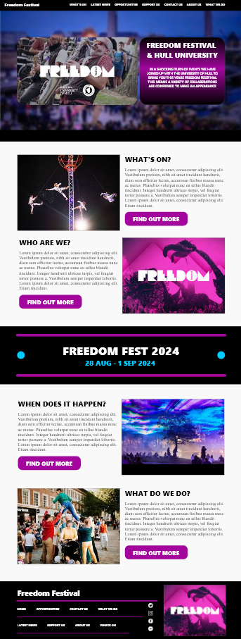

Mockup
A Mockup is a higher fidelity design essentially filling out a wireframe with real images, typography and colour schemes in order to move the design on and find what visual elements work with the layout that was chosen. One such example of how mockups can accelerate a design’s progress is in this particular mockup design as it allowed me to start establishing a colour scheme for the website I ended up settling on a mix of pink and blue. I believe this works as it still appeals to kids mimicking similar colours to the recognisable pink and blue sweets however it can also appeal to the more adult audience as it feels less childish and more professional as complimented by the meaning of blue in colour theory being one of professionalism, stability and trustworthiness.
