Refreshed Brand Identity
The first step in redesigning the Freedom Festival is giving it a new identity. The most crucial aspects of this being the color scheme and logo. These elements are often the first things customers will notice about a brand, making them the most important factors to consider when reassessing the brand identity, looking at the first impression that it gives people viewing the brand or event.
Initial design
My initial design was this using pink and blue shades to give a fun but professional appearance, in a design that was later decided to be too focused on the art aspect of the Freedom Festival rather than the festival as a whole. However, I ended up keeping the colour scheme for my later designs as it worked well to achieve the goal of making the festival more appealing to adults while still being interesting to kids, maintaining the, accessible to all, brand image behind the festival.
Things to Consider
Looking at the original Text design it felt very industrial as if it were buildings popping up, I wanted to keep this feeling of motion in my redesign but in the form of a graphic logo, I also noted that the festival and this particular rendition of the brand is very people focused. Upon further research into the event I realised the main focus was on people expressing themselves through different forms of art and performance so I also wanted to capture that in my redesign. It’s also worth considering the elements of the design that can be replicated and applied to other contexts such as the app or website, so in my redesign I looked into elements that work with the main logo design and be spread across other media in order to tie them together and create a cohesive art style for the Freedom Festival.
The Redesign Process
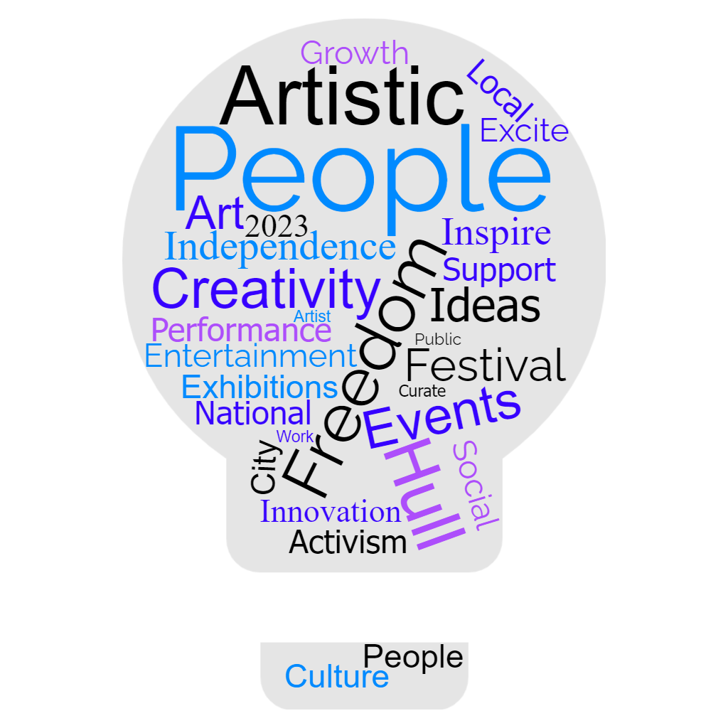
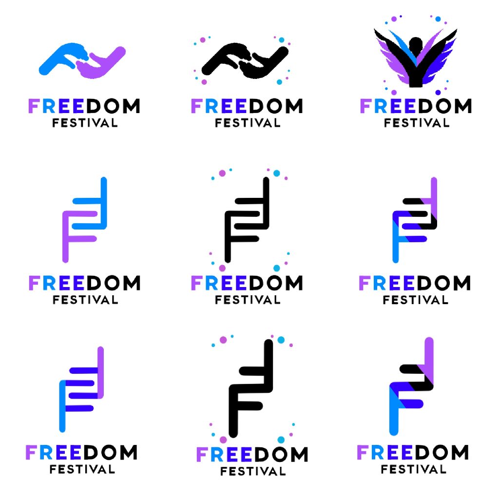
When it finally came to redesigning I wasn’t sure what direction to go in so the first thing I did was come up with a small word cloud of the Important words associated with the festival itself based on the current websites information. The Main Words that stood out to me were “People”, “Freedom” and “Creativity” so I started thinking how these could translate into actual designs. Being the main focus I knew i wanted to place people at the heart of the design language so in my brainstorming my first thought was how to make text convey that message. I then noted the shape of the F could be interpreted as almost a lego hand which sparked a few designs as seen on my idea page.
So working from that idea I attempted a few designs (the bottom 6) with different forms, elements, and uses of colour to establish what worked the best. However the more I looked at the design the less it matched the Freedom Festivals Brand Image, this mixed with the feedback of others not seeing the connection of the F’s and two hands holding I decided to go one step further making the F’s into hands to further illustrate the point. I also created a separate logo incorporating more of the human form and leaning more towards freedom of expression as an alternative. I ended up preferring this design over my previous designs as it really hit the goal of making people the focus at the forefront of the design, however decided to keep the Hand logo for other uses elsewhere as part of marketing and apparel for the festival.
The Font used for these particular designs is not the final font I decided on however the colour scheme used on it is there to be potentially used across all forms of media where it suits the background. The colouring is laid out this way in order to emphasise the word “Free” tying back to the freedom festivals roots with Wilberforce and Anti Slavery.
When creating this design i decided to lean more into the idea of celebrating the individual freedom to express oneself as i think this would match the current idea of the festival in a refreshed more modern light matching the current trends and celebrating a more diverse society where everyone is different.
Final Redesign
Moving on to the actual redesign I refined the design to put the silhouette at the front and curved the base of the person in order to match the curves into points or the rest of the design. The Idea behind this design is incorporating the original idea of wings while also emphasising People and the performances that are a key part of the Freedom Festival. The wings are also using the brand colours which, as well as maintaining brand consistency, hints towards the expressive outfits worn by performers in the festival. I also included visual elements on the corners of the design that could be replicated for other forms of media to maintain a strong visual identity for the brand across all platforms.


