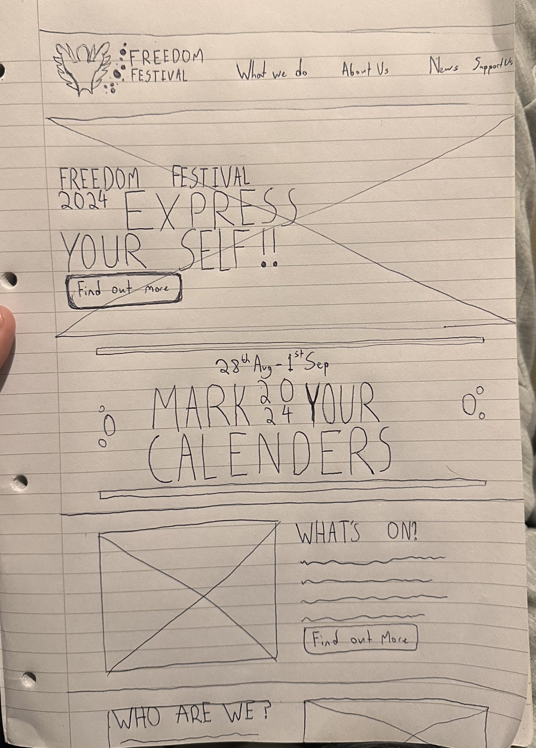
The first step in the process was to Wireframe the basic design, for this i went with pen and paper drawing a basic layout that i think matches the aesthetic and functional layout requirements needed for the freedom festival website redesign. I decided to go with a unique collage themed title to pull in the initial users attention as they come onto the homepage, before i bombard them with information about the festival. I wanted the main goal of the website to be centred around portraying the new date for the festival as well as the other pertinent information, therefore for the date section i made it almost as big as the title in order to really make sure its hard to miss, if there was one thing i wanted the user to remember it would be that and the name so these having priority in the hierarchy is acceptable as it aligns with the overarching goal. I also chose to reduce the amount of headers on the page, i did this as i believe the current 7 menu items are a bit too much for the user and were affecting the user experience so by reducing them we are offering less distractions from the main information on the page. I also added some small design elements to match the logo theme design with the clusters of circles and round ish edgeson all the buttons.
Initial Prototype Design
In practice i found that the date for the festival took up too much attention from the actual title when it was at the start of the page, therefore to counteract this i moved it further down after some relevant information about the festival.
When i was looking into the Date itself i tried a few ideas for layouts but i ended up settling on this design due to the fact that it sneaks 2024 and 24 into the design keeping the festival up to date and more relevant to younger audiences, i also managed to reuse this element in the title to make it look more interesting than just the writing on its own.
I decided to create a section for the “support us” as i believe this is where the festival could link to their shop/ donation page in order to drive more sales and in turn promote the event through a mix of social media buzz and walking advertisements in the form of people wearing merchandise.
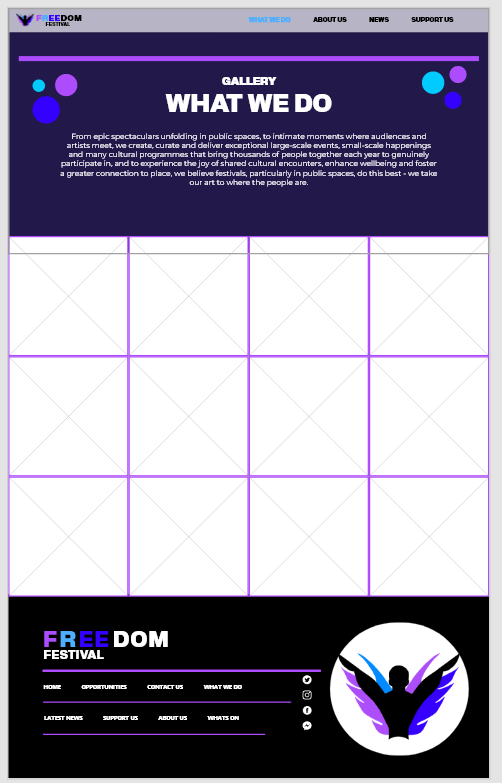
Example second page
For this example i went for the gallery/what we do page, just to illustrate further how the design translates off the main page, it continues the themes making sure the pages although separate feel related, here is an example of one without the elements and one with, i believe it’s clear to see which one is better user interface based on this alone.
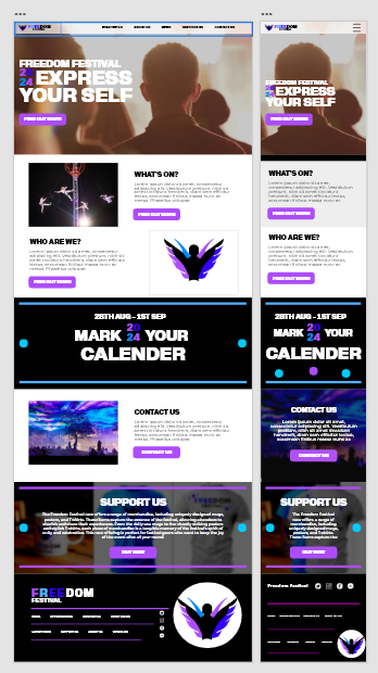
Mobile version/ Responsive design
When Resizing down to a mobile version it was important to me that the content should stay the same, therefore my design process was if it needed to be removed to keep the content there i would either move or remove it completely. Luckily most of my design with some reworking was able to stay the same without the loss of many media elements. I also decided to work on a Footer for the pages, which should translate across all pages on the site. This type of recurring design helps elevate the page along with creating a sense of consistency across all the project, elements like these allow people visiting the web page to automatically know what website they have reached, ideally all website should follow this criteria as its a similar concept to having a brand image.