Branded Merchandise
The biggest area the Freedom Festival is lacking in at the moment is Merchandise or should i say the lack of, the festival is missing out on potential free advertisement all year round from things such as mugs, hoodies, shirts, bracelets etc… seeing these items in or around someone you know peaks curiosity and brings in more festival participants, so in this post i’m going through the different types of merchandise and how it could help the festival by offering them along with a bit about my designs and the process behind them.
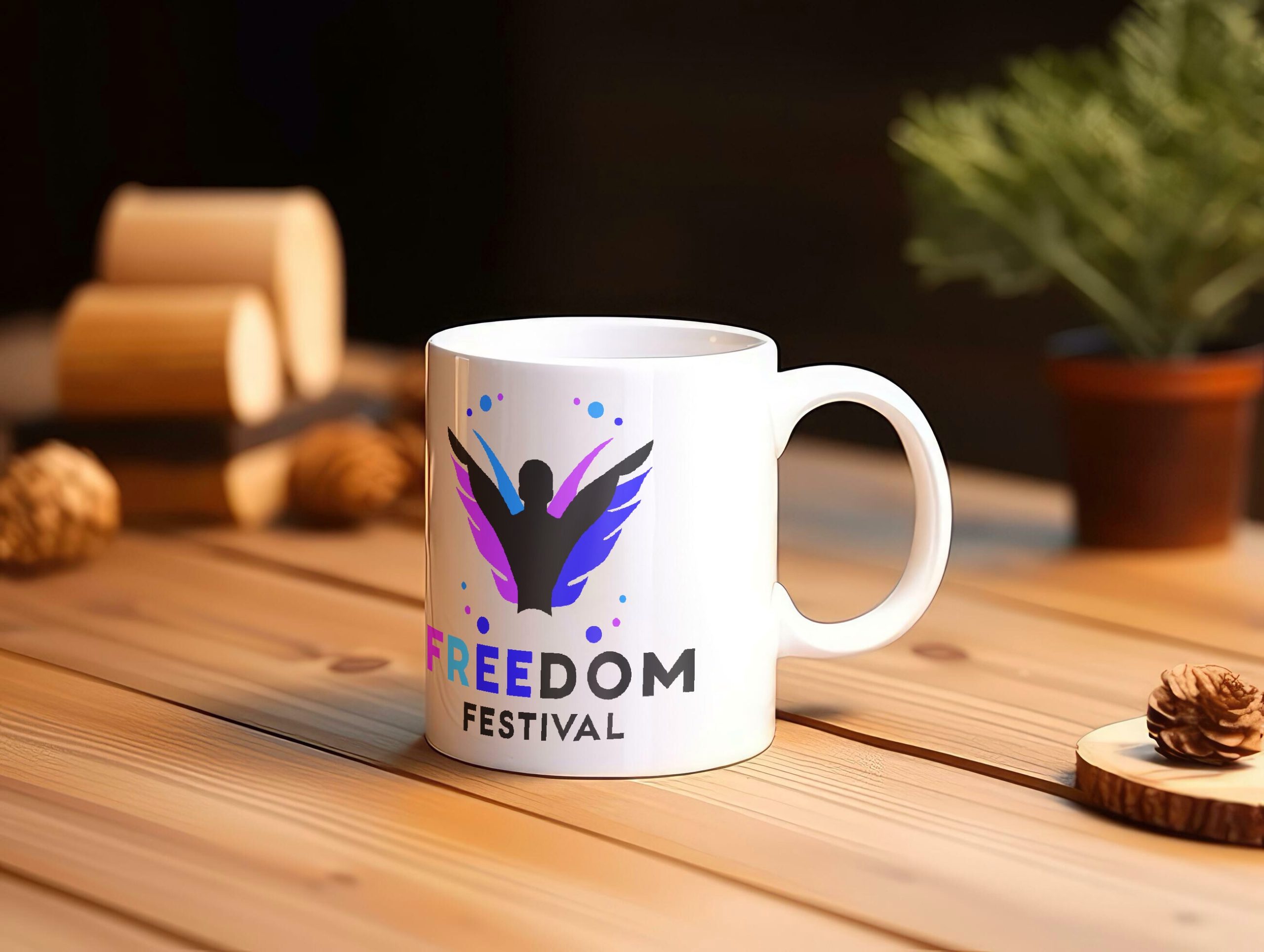
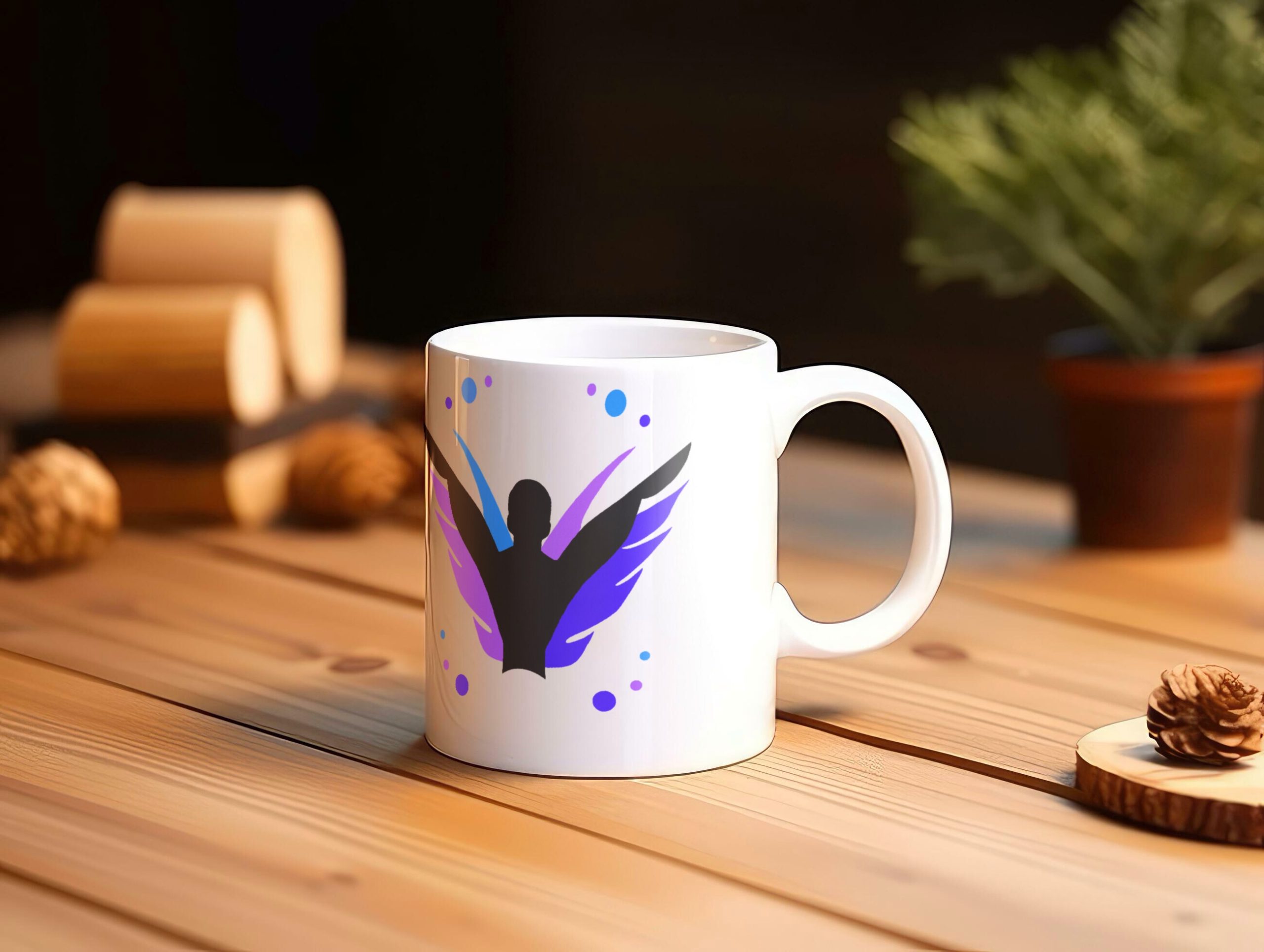
Mug Designs
One of the more popular merchandise items with the older generation the Mug will see its fair share of use in any given home. Mugs are often given to family and friends invited over for hot drinks, or laid out on the counter for all to see, therefore getting your brand on a mug in someone’s home becomes essentially the quietest form of word of mouth advertising. I say this because now anytime people see that mug in a house they will think, ask or look up about the freedom festival, bringing in more potential visitors for the festival.
For the design i chose to go simple keeping the brand logo aesthetic while also making sure to add the accents for brand consistency. The main challenge I faced with this design however is whether or not the text should be there on the mug or if the brand would work as a standalone. In the end i decided to use both designs however in theory the mug without text would have the words freedom festival written on the opposite side of the mug in order to make sure it works as an effective lasting advertisement in peoples homes. It’s also important to mention its just generally a good look on the brand to sell something that does its purpose and achieves its goal staying very on brand.
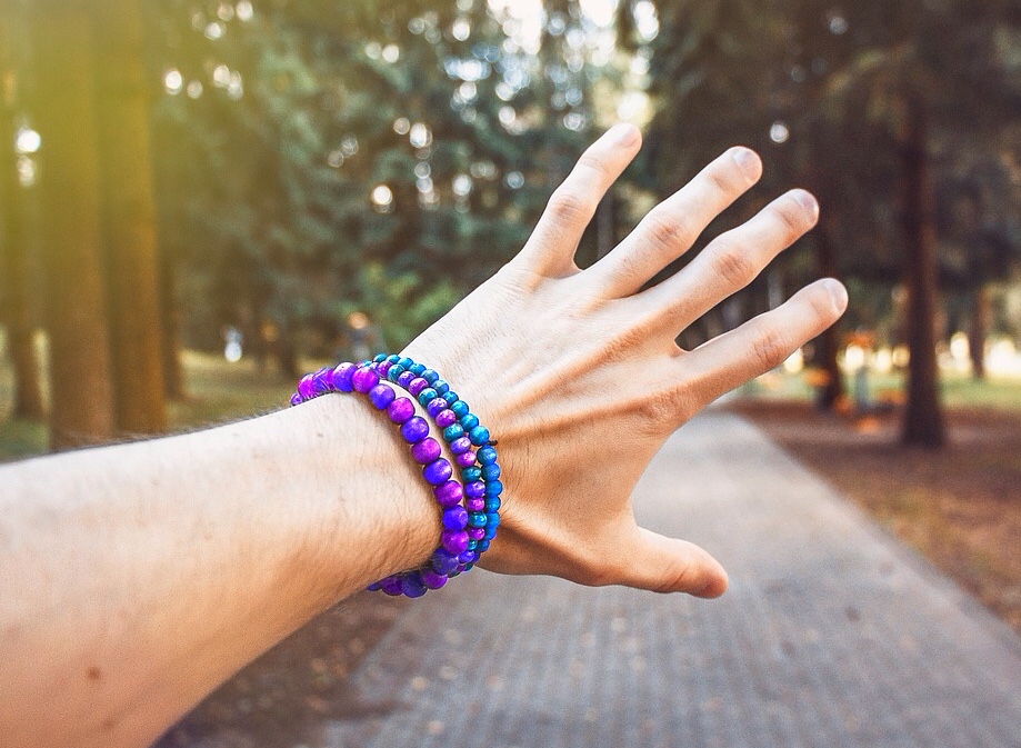
Jewellery Designs
Bracelets can worn in many ways to raise the level of any event and act as a lasting memory to any participant while remaining a stylish accessory. When it came to designing these bracelets i decided to go for a pearl look, aiming to somewhat match current fashion trends in hopes that people would wear the bracelets around advertising the festival further when people ask where they got them from. But the main idea behind the bracelets is that they could be used for many different use cases, for example certain colours may be vip bands to meet performers etc, or they could be a colour to symbolise event staff members. The general idea being that the target audience could be anybody and the purpose behind the bands could be tailored to whatever the event needs or just as a nice piece of merchandise to remind people of the festival and their experience with it.
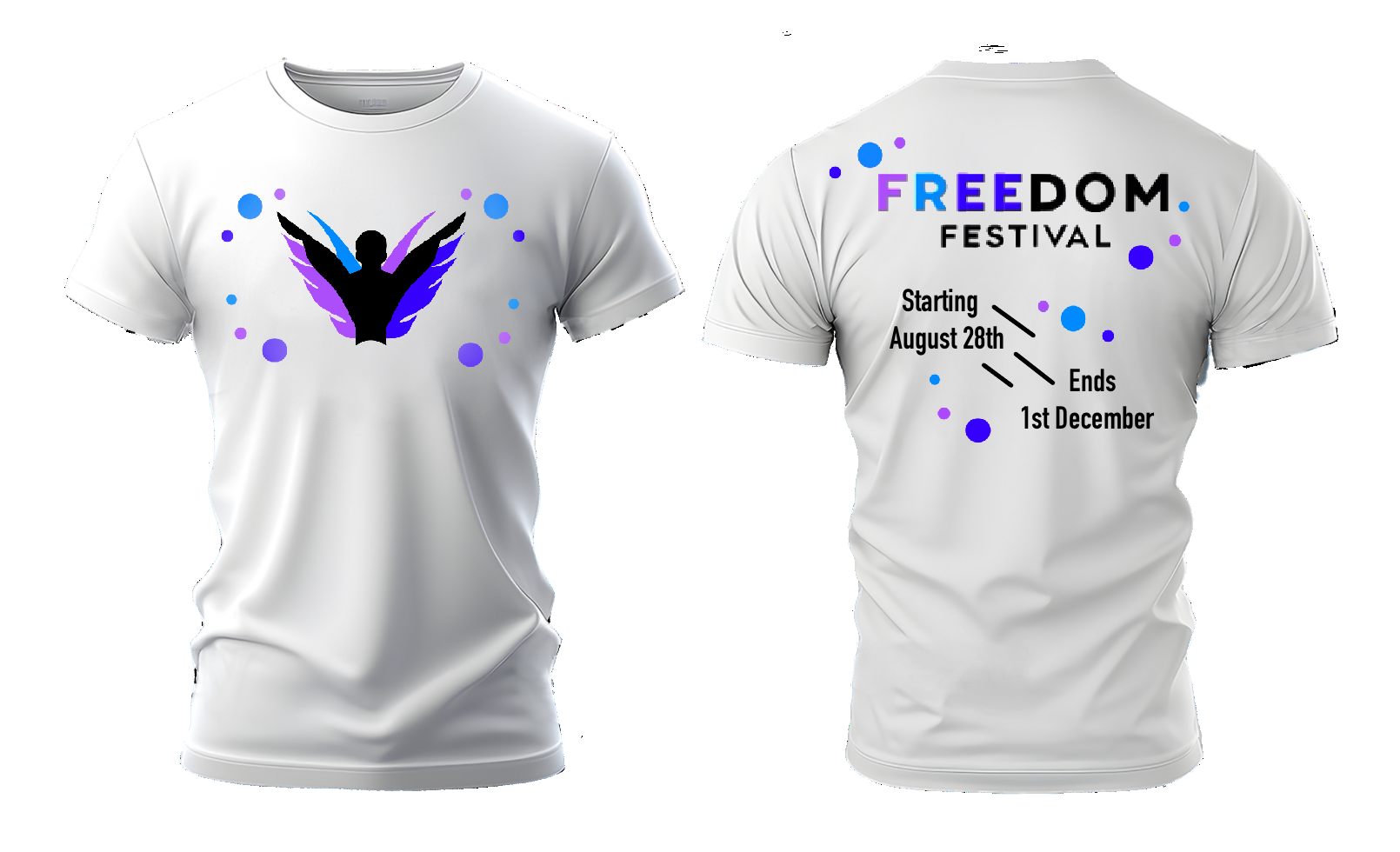
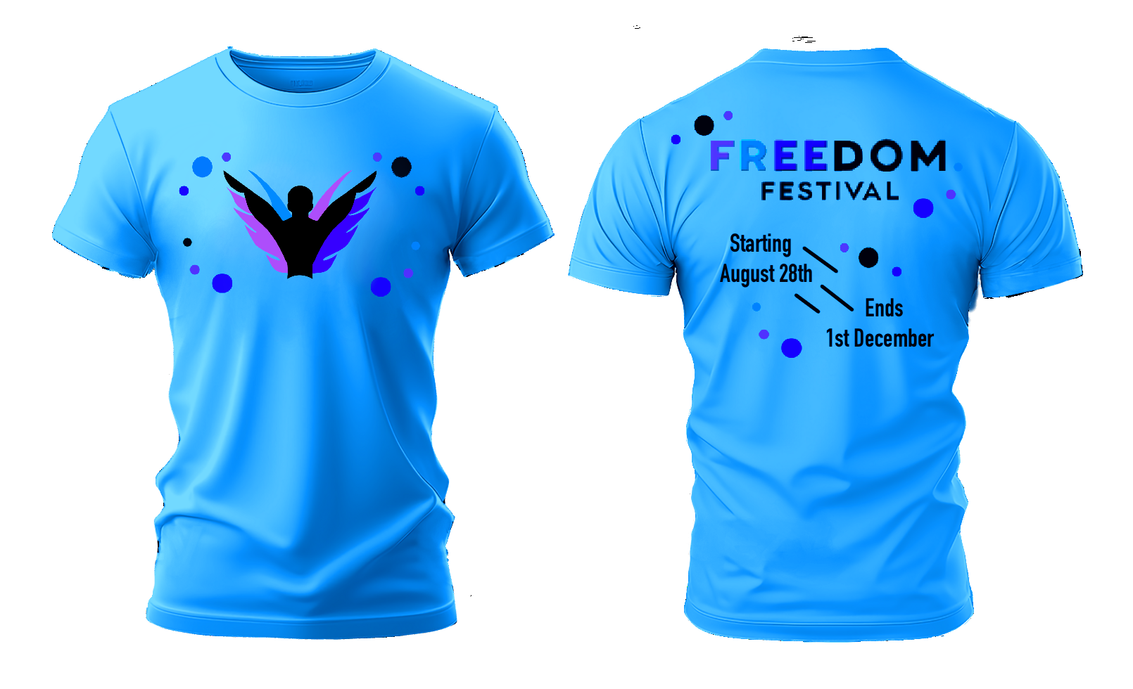
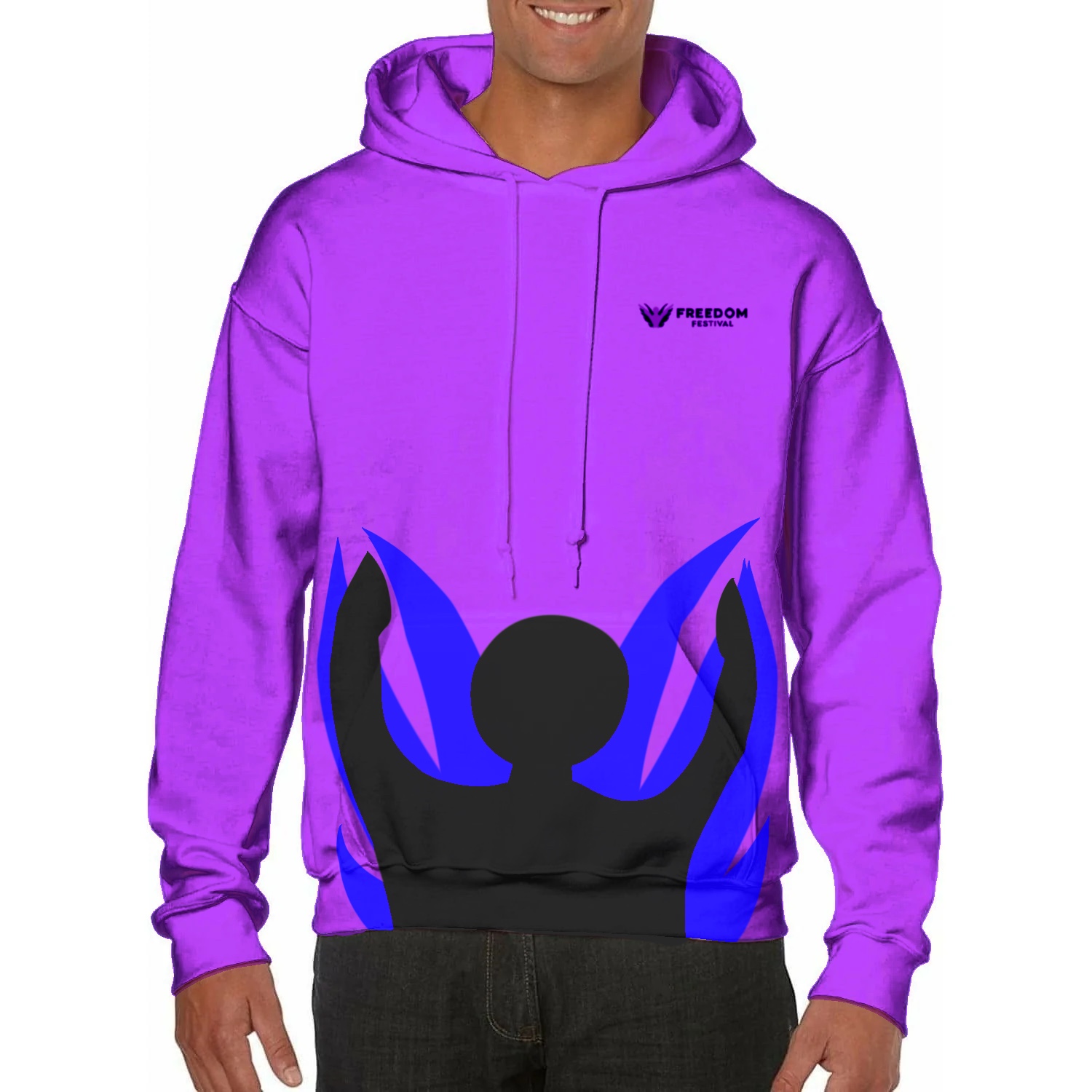
Clothing Designs
The main merchandise for any event or brand is always the shirts and hoodies, these are often the most popular and easiest to spot types of branded items and therefore its imperative for the design to stand out and empower the visibility of the freedom festival when its seen worn in public. These items should get people interested enough that they ask what the festival is and maybe even how the could get involved. For the actual design of the shirts i went for a similar concept to band t-shirts opting for a logo design on front with information along the back to keep it simple yet interesting enough to peak attention. Whereas for the hoodie design i went for a more bold approach opting for a pure design based product with only a small logo in order to promote wearers being asked where they got the hoodie from and tell them more leaning once again into word of mouth advertising as a powerful way to get the event talked about around the area.
Shop Design
When it came to creating the store page i decided to prioritise first the information originally on the support us page before leaning into the storefront page. The main goal of the page is not necessarily to sell to you but to encorage supporting the festival in whatever way is possible for you, and therefore i believed the best way to do that was to act like the shop was more of an afterthought meanwhile heavily angling towards helping the festival with funding. I kept the design theme the same in order to match the rest of the website maintaining the bubble/dot effect in the background in order to keep the blank text sections more visually appealing. I also included a special offer in order to show off how that could look in this design format allowing for greater freedom on price in the future as well as promotional events like the one in the email marketing campaign to look good in practice on the webpage.
