Accessibility considerations
When it comes to building websites it is always important to consider the needs of those with accessibility concerns whether it be colour blindness, complete blindness or any other disability it’s important that their experience with the website is not altered because of their disability. Therefore when building a website it’s important to make the following considerations.
Accessibility considerations
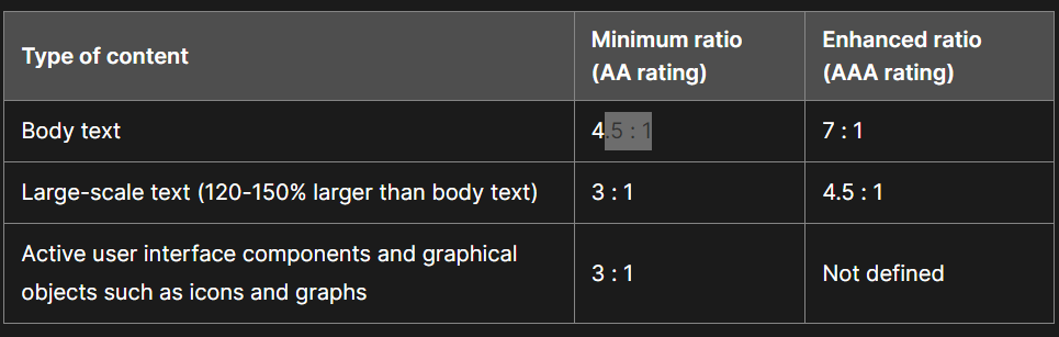
- Colour, Contrast and Legibility – In order to make sure that all users can read the text it is very important that the body text has a 4.5 : 1 ratio for contrast at the minimum in order to achieve this goal. It’s also important that colour is not relied upon to convey a meaning so people with colour blindness don’t miss out on important information, so it’s advised to use patterns/ labels as an alternative on top of the colour, for example, stop signs aren’t just red they are also labelled STOP so no matter what the message is conveyed as intended. On the topic of typography, this also needs to be easily legible, it’s less important for titles as they tend to be bigger so can get away with more decorative fonts but for body text and subheadings, the typography needs to be easily readable.
- Use of Audio and Digital Media – When it comes to images it’s important to include Alt text which is a short description of what’s included in an image to allow for people who can’t see it to still understand what’s there. This is similar to other audio and visual media which all require digital transcripts, captions and audio descriptions in order to be easily accessed by all users.
- Screen Readers, – The layout of your page and hierarchy become even more important when accessed by a screen reader, it needs to know what information comes first in the hierarchy in order of what you want to display to them first.
- Interactive Elements – Moving on to Interactive elements it is important to describe what the element does. It’s also important to consider the size of the button, for visually impaired people small buttons may be hard to press so adequate spacing and large touch targets are much easier to use.
References
- Cohen, G. (no date) Georgy Cohen, Meet Content. Available at: https://meetcontent.com/blog/accessibility-considerations-for-web-content/ (Accessed: 18 November 2023).
-
MozDevNet (no date) Color contrast – accessibility: MDN, MDN Web Docs. Available at: https://developer.mozilla.org/en-US/docs/Web/Accessibility/Understanding_WCAG/Perceivable/Color_contrast (Accessed: 19 November 2023).
