Festival Website Analysis
In this analysis, I will aim to explain the design choices and user experience of each site
Website 1 - EDINBURGH ART FESTIVAL
Structure – The website for the Edinburgh Art Festival is quite clean, using a surprisingly small amount of images and opting for mostly solid colours with small almost instagram layout images on their landing page. However, as you progress through the website the images become more frequent. I think this choice works as an introduction building up to the larger amounts of images the art festival will have as to not overwhelm new users with little knowledge of the event. Gradually introducing the art to them in a familiar Instagram-like recognisable format instead of immediately thrusting it in the face is a smart way to tailor your website to an increasing phone browser-based market, reducing the chances of new users leaving the site upon arrival. However, I believe in doing so they have lost some of the personality behind the event and its brand, becoming too minimalist for such an expressive cultural event. The website is structured in a repeating pattern of sections consistently going from 2 non-stretched sections then one stretched section with a pastel background, before changing to one stretched one unstretched further down the page. This Keeps the website both consistent and interesting to read.
Colour – The colour palette used for this website is mostly pastel orange, pink and blue with a white background and black text. I like this design choice as it makes the festival very friendly and inviting, which is a message shared widely by arts festivals due to the emphasis on creative expression and inclusivity
User Experience – the experience using this website was quite positive it was easy to get to the homepage, and there was a helpful highlight on the menu for the page you’re on, however, I did find that when there are no more than 3 items on the side-scrolling post list like on the second section of the homepage it doesn’t move and therefore gives the impression it doesn’t work. In order to improve I would probably add in some kind of interaction or animation to show there are no more items to scroll to with the buttons, especially in a reusable component like this which is copied for other sections.
Overview
Overall My favourite part of this design was the use of the card format that resembles social media posts format this is the perfect way to tailor to modern audiences and make it more accessible for younger people, while also maintaining a good design aesthetic, i just wish they would have kept it for all sections rather than just for the first, as this would create more consistency in the design, especially since the section is the same design.
Website 2 - ART HISTORY FESTIVAL
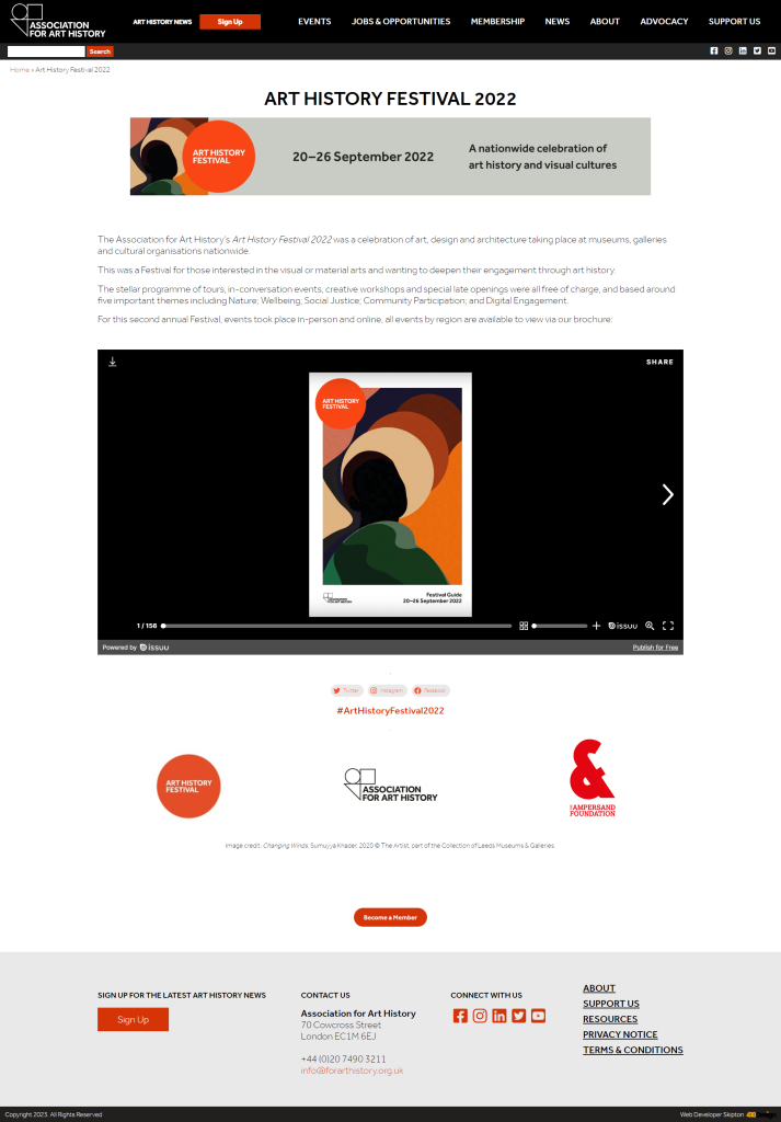
Structure – The structure of this website is fairly simple for the majority it sticks to a single column with sections of the same width however as you get deeper into the website this evolves and changes depending on the content and its requirements. One thing this design does really well is getting information across with minimal large text areas and even where that is required they are structured into bulleted lists with important information highlighted in bold and in the relevant colours to match the website theme.

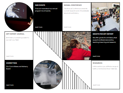
This particular layout I found on the homepage was quite unique using geometry to keep the information separated and further working with the abstract nature of art and how shapes can be used together to make something new and interesting.
Colour – The colour scheme on the website is very consistent with the toned-down reds and oranges on a white background, keeping it consistent means all points of interest can easily be found on the sight in the main red colour. However this can also be a problem as the colour is used fairly often in the site it could be argued it makes elements fight for the user’s attention which could lead to users struggling to find the important information they came for like dates and locations for the events.
User Experience – The website although not all about the festival itself is fairly easy to navigate with its own searchbar for pages up in the top left of the menu along with a helpful menu list and social media sharing buttons placed around the site. This is a very important feature for modern websites especially when there’s an event as people can share the event with friends and family allowing for word of mouth advertising to take place.
Overview
Overall the website is well laid out and designed. It is responsive when tried on mobile and has easily accessible social media sharing, this makes it great as it shows the website has adapted to the times and can also keep consistent with its design theme of minimalist red and black designs. My favourite element of this website by far has to be the layout found above as it shows their willingness to use creativity in their designs which is the whole point of art festivals, expressing yourself through art, and I think this gets that across quite well on the homepage.


