Cover Designs
The Idea
I wanted to do my project a little differently so i decided to do advertisements for three movies in a trilogy instead of cover designs
The first thing I chose to tackle was the actual idea behind the 3 movies I was creating the designs for, this is in order to get a more clear idea of what I’m portraying and aid in conceptual design, allowing me to know the answer to questions like; Where can I include conceptual design? What type of colors I should use? Who is this appealing to? What do I want this to link to or represent?
I did this by writing a short plot summary of what could happen in these movies, all happening in a trilogy but with a new chapter of the story in each so I can justify the variance in design. Tailoring to the target audience, I mimicked the feel of star wars films placing them all in the same genre/style of star wars. I couldn’t include this due to word count constraints but this will help to understand what I’m going for with my designs.
My Design's
Then came the actual designs, I tried to give them all a slightly different feel to each other so it wasn’t too similar to better fit the assignment brief.
Part 1 Cover

For my first cover design, I went for a highly conceptual design choosing a butterfly, a symbol of a new beginning and freedom, and relating it to chains a symbol of imprisonment, the idea being to create an idea of oppression in the viewers mind as this relates to the themes established in the film brief. For typography I followed my typographical standards sheet for the Title “Awakening” I chose to leave this one as not block capitals to emphasize this is the beginning as when I think block capitals my first thought is strong and established which at this point in the story is not the case, as the rebellion is just starting. I chose to use the bold green color for my title logo designs as it’s a symbol of new beginnings, and the starting of something in fact its use in traffic lights proves this point.
Part 2 Cover
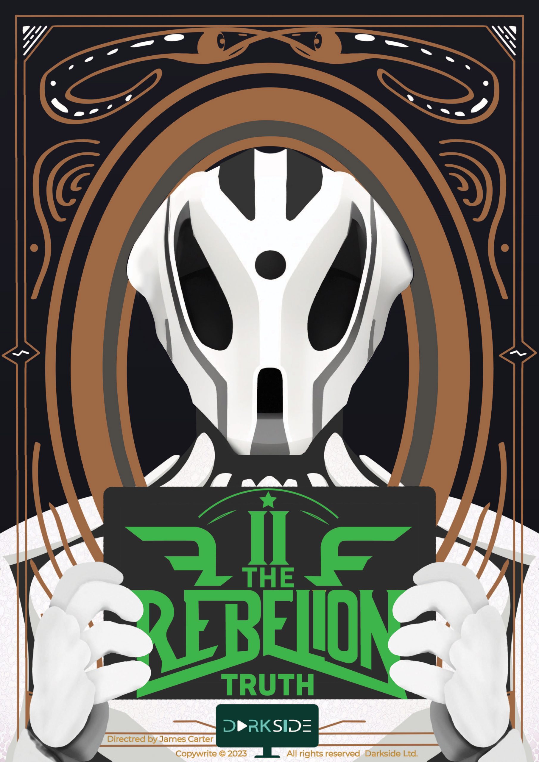
For my second cover design, I wanted to focus a bit more on the story so I went with my depiction of the bounty hunter character. This also has a subtle conceptual idea behind it as well, this comes from the position looking directly at the “camera” combined with the holding up of a sign can be closely related to criminals’ mugshots. It can also be stated that the fact the sign holds the title “the rebelion” could emphasize the idea of him committing crimes against the rebels but does it in a subtle enough manner to not give anything away. In the typography, I went for block caps as by this point the rebellion is more established, enough to be considered threatening which coincides with the subtext of saying things in block capitals over messages. For this cover, I also wanted to give it some personality as this film would be exploring characters’ backgrounds therefore I used the background to represent this giving almost a tribal cultural feel to the design.
Part 3 Cover
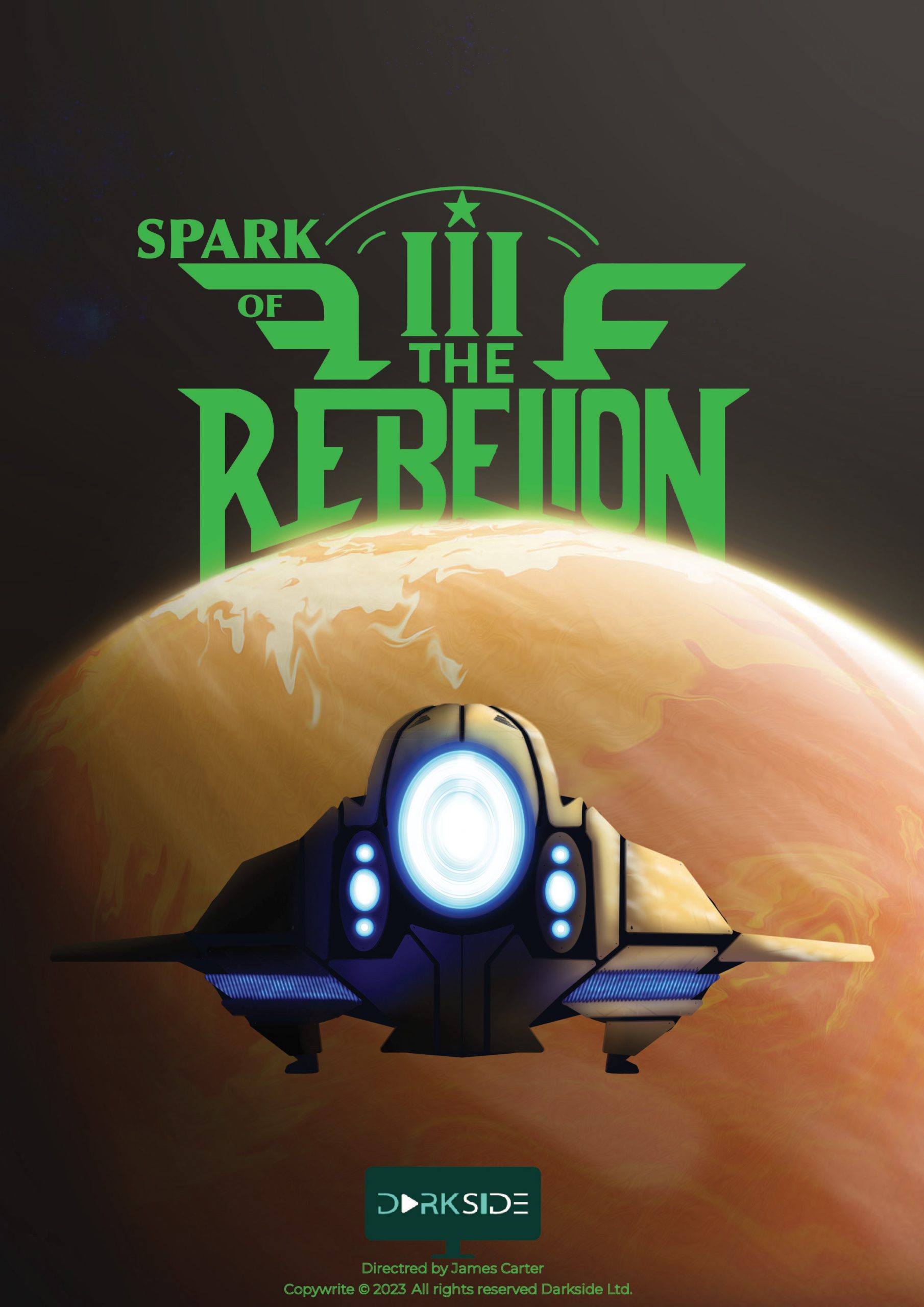
For the final design, I wanted to try more of a different style going more 3D to give the subject a bigger sense of scale emphasizing the scale of the rebelion in this part of the trilogy. I also tried to work on bringing in some conceptual design placing the title behind the planet’s horizon to link the size of a planet to the strength of the opposition as they try to stop the rebelion on the horizon. The composition of these movie covers remains fairly consistent containing the Studio’s logo and other information at the bottom of the design keeping both the title logo and the footer information always centered.
