Conceptual Energy Drink Animation Storyboard
My First Idea
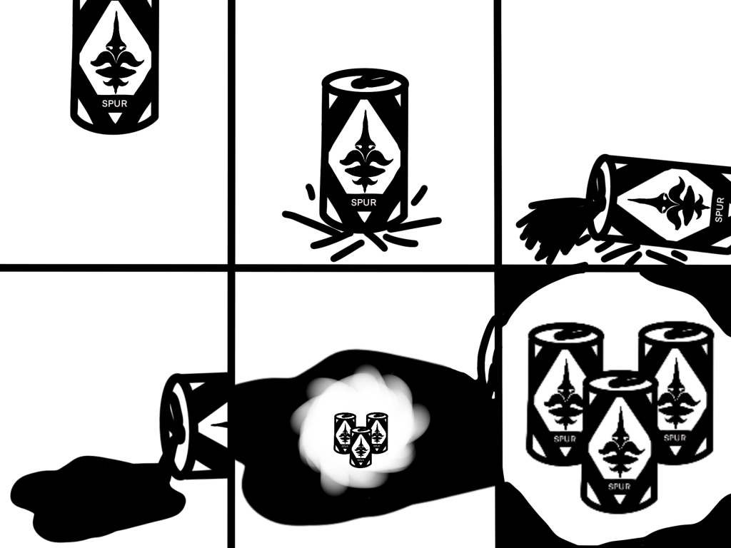
My First idea with the initial logo concept was a can falling from the top of the screen causing a crash before spilling to reveal a portal in the liquid in the portal the camera follows it through to what would’ve been an in colour image of the cans in their different flavours, the idea being the transition from black and white to colour would illustrate the drink bringing older people their energy back as if they were 20 again giving them the energy to do the things they always wanted to do.
However as i became more familiar with the software i realised this was a little out of my skill level at the current time and therefore when i sorted out the new logo and packaging design i set to work figuring out what i could do and what worked best for me while still keeping some of the base components such as the falling can and transitioning from one type of can to others.
The Final Storyboard
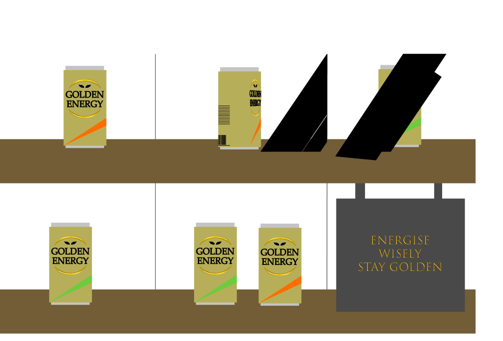
When Redoing the storyboard i decided to focus more on the can design/ conceptual design itself looking more into the brand and packaging than other things happening in the animation, however to keep it a little interesting i kept a transition between the two flavour cans and kept the falling can animation in order to get the side by side shot of the final two flavours. I also decided to include a sign at the end using one of my taglines i came up with earlier in order to get a clearer brand image into the animated video. Overall i would say working in 3d is more difficult than i remember, in general finding how to make your vision into a 3d animated render can strain what you believe is possible within these applications. However despite not being the best animator i believe i got my point across with this animation as it illustrates the high class design while not being too overwhelming/ overpowering to the viewer a simple animation to illustrate a simple point. Conceptually the idea behind the animation has slightly changed as its evolved into linking the idea of Gold and the connotations of wealth and success with an energy drink in order to give the consumer feelings of a premium drinking experience to re energise the hard working over 60s back to health and “Stay Golden” in their golden years.