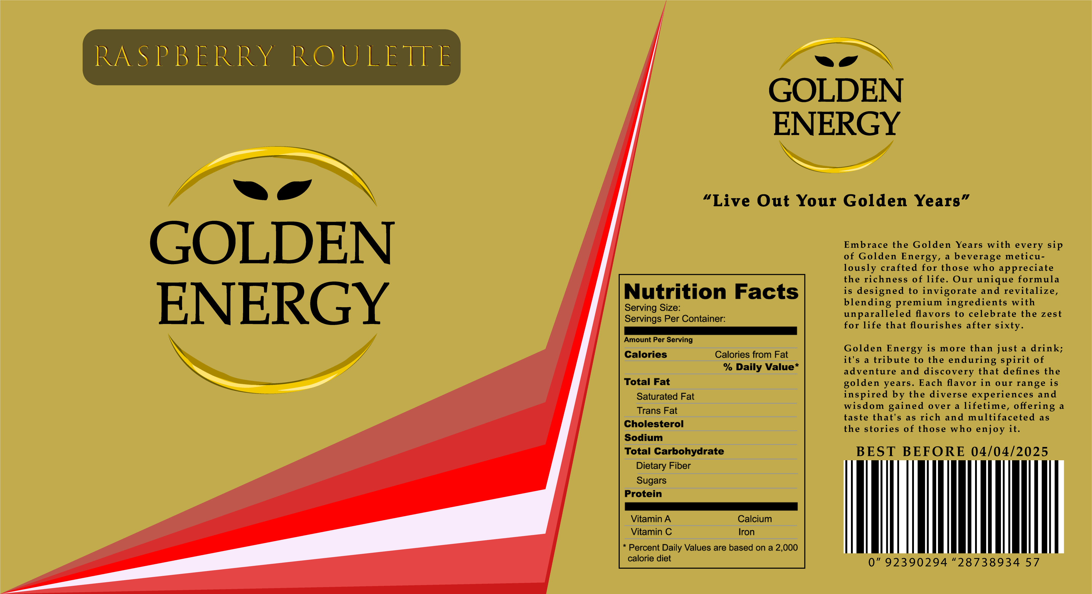
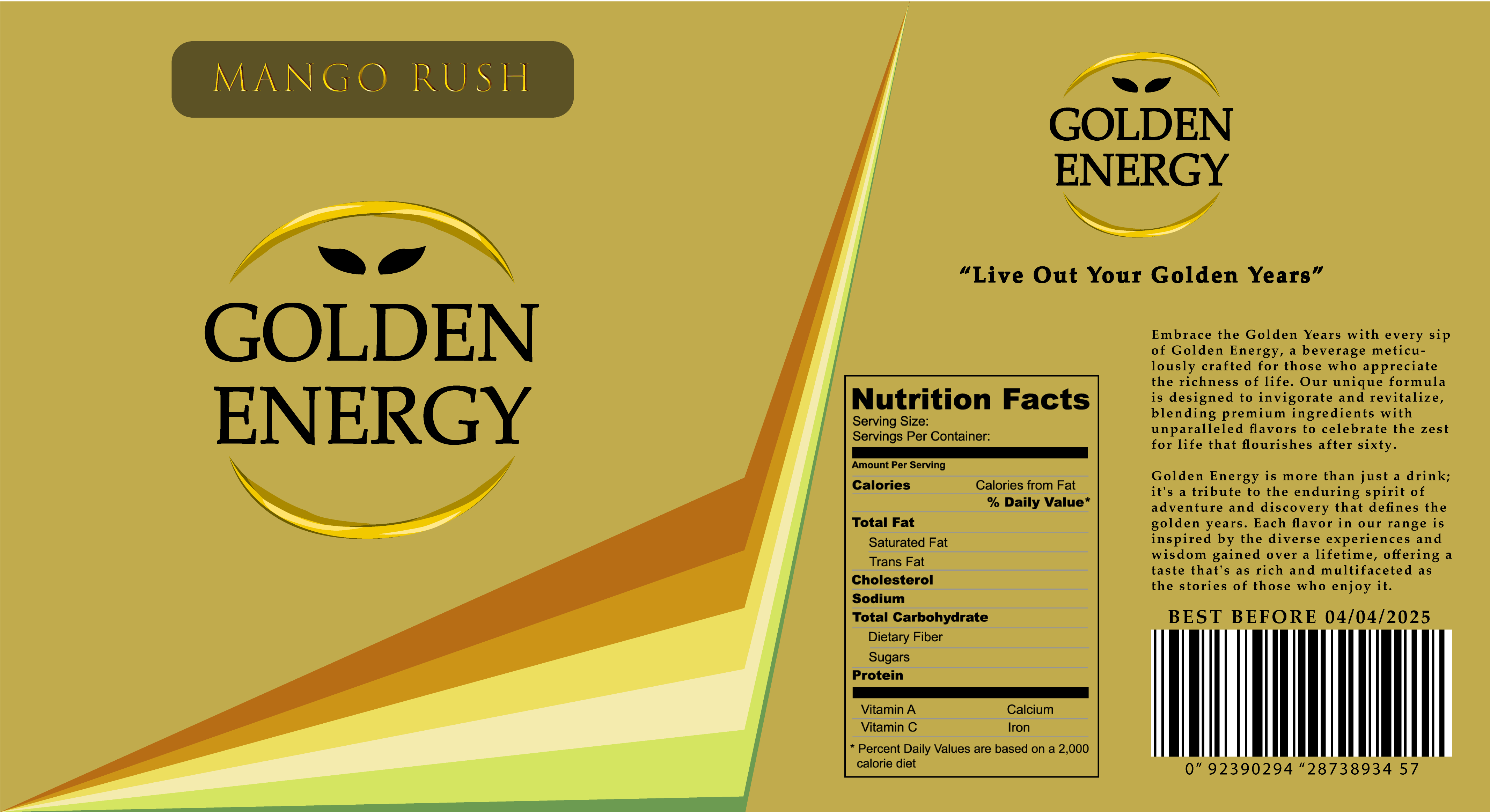
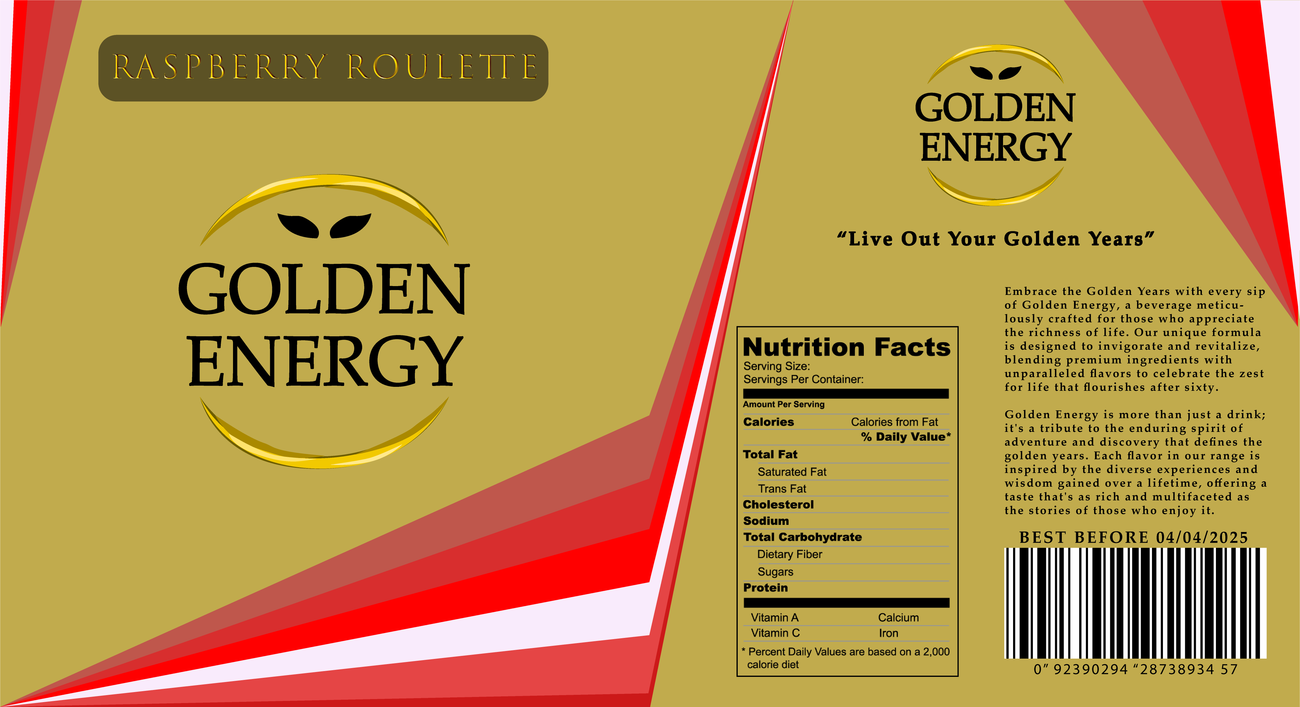
When it finally came to making my design i Wanted to carry on targeting the higher class older generation and again the best colour for this was gold. On a silver can this almost mimics the effects of jewellery, having a golden drink could be a statement of wealth/success for the over 60s consumer, so it was important to me to further emphasise this gold point by embracing it with the full package design. One of the main reasons for choosing this is that gold has been a symbol of wealth for centuries with a rich history of being owned byonly the wealthiest individuals in society. Although those times have passed mostly now gold still remains a valuable commodity. One that is especially respected by the older generations which are more likely to understand and have the motivation/ funds to back up such statements of wealth and prosperity.
Raspberry Roulette Packaging
Mango Rush Packaging
I also created a few taglines for the brand (“Energise Wisely, Stay Golden”, “Live Out Your Golden Years”) Designed to put more emphasis on the target audience being over 60s and that it is meant to help the older generations feel young again. This could even be explored further into a similar style advert as “redbull gives you wings” except the drink makes the person look and feel younger after drinking (even though it actually doesn’t it would just make them feel more energised to do more).
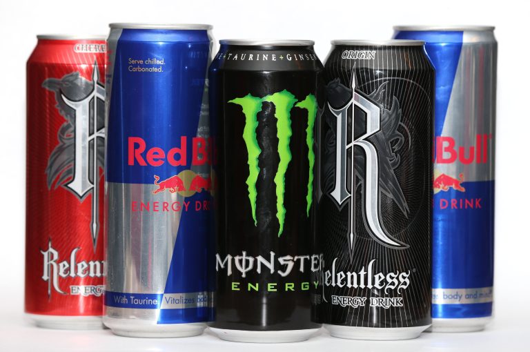
Other Energy Drinks
Looking at other energy drinks they conventionally use oversaturated primary colours in order to attract a younger audience. For my design i planned on mimicking this but tailoring it towards the potentially more refined person, leaning more on perceived value rather than attempting to stand out by being the brightest colour as so many other brands do.
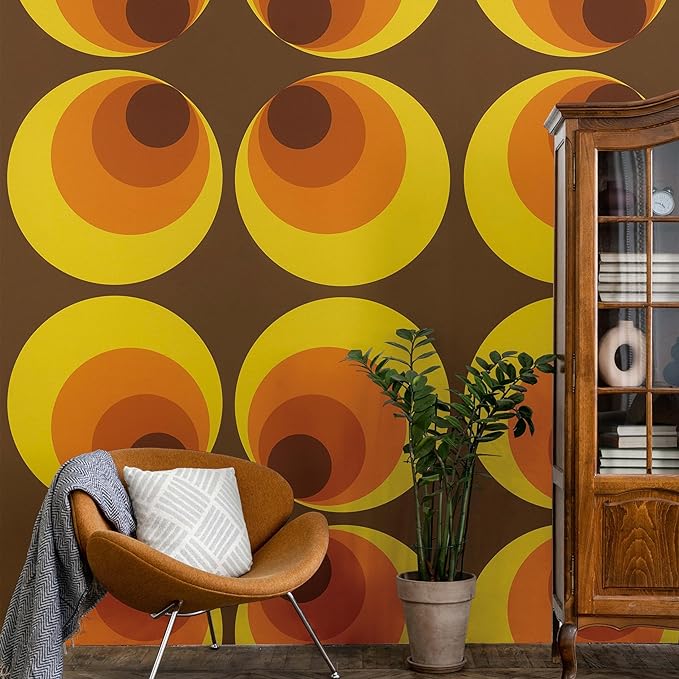
2) AS-creation (no date)
I decided to do two different flavours. I wanted these to be sophisticated, classy, almost exotic sounding; as this matches the premium brand design language I’ve attempted to employ throughout this whole product design process. The older generations are more likely to respect quality over quantity a lesson we all learn at some point, and therefore it was imperative that the designs for the flavours continued the high quality premium feeling with the subtle design elements. In the end i settled on this shooting light line effect inspired by this 1970s style wallpaper where the vectors create a solid gradient in a shape. This effect makes it easy to display a variety of necessary colours in order to illustrate accurately any fruit flavour needed making it very versatile. I did attempt to add more elements to make it more energetic but it ended up reducing the minimalism clean effect that gave it the premium feeling.
Raspberry Roulette Packaging Rejected Variant
References
Sarah (2019) Is a ban the answer?, Supermarket News. Available at: https://supermarketnews.co.nz/news/is-a-ban-the-answer-countdown-to-ban-sales-of-energy-drinks-to-under-16s/ (Accessed: 28 March 2024).
A.S. Creation 701312 retro wallpaper yellow, orange, red, Brown 70s vintage,1’8’’ x 32’11 (no date) Amazon.co.uk: DIY & Tools. Available at: https://www.amazon.co.uk/S-Creation-701312-Wallpaper-Vintage/dp/B000KJK25Y/ref=asc_df_B000KJK25Y?tag=bingshoppinga-21&linkCode=df0&hvadid=80745442135220&hvnetw=o&hvqmt=e&hvbmt=be&hvdev=c&hvlocint=&hvlocphy=&hvtargid=pla-4584345018813538&th=1 (Accessed: 26 March 2024).