Conceptual Energy Drink Brand Logo
My Initial Idea
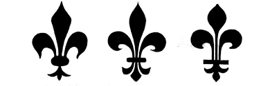
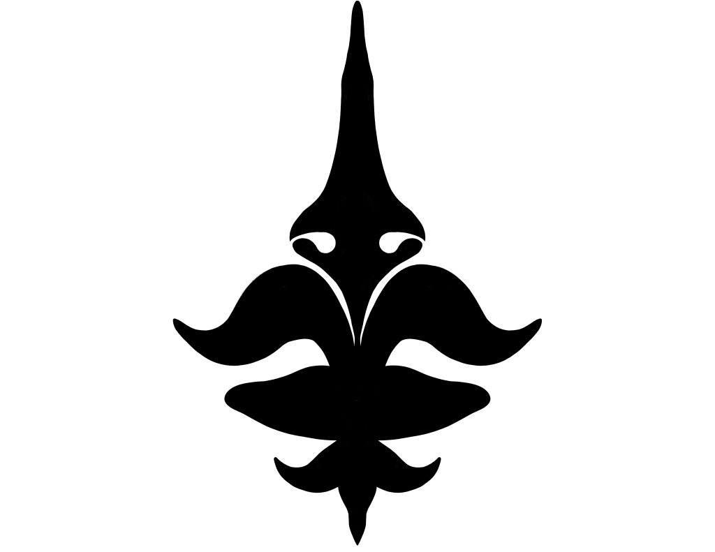
My first idea when approaching this project was to use the fleur de lis symbol in my design in some way. I had chosen this as it was my first thought when attempting to think of old yet recognisable symbols that could be manipulated to create a conceptual logo. So in my first interpretation i attempted to go in this direction following the general lines of the original symbol while also trying to make it new and conceptual to match the product brief and appeal to the over 60s population. However after looking further into the symbol it seemed to have more of a connection with monarchs and the french than i initially believed, this paired with the symbol not being easily identifiable after being redesigned made me consider moving in a different direction for the logo design. The initial idea was that the symbol would resemble an old man however after considering the meaning behind the symbol and how it turned out this gave me a new idea. Tailoring the drink to the more high class individuals almost like the monarchy, this would hopefully appeal to the older generation and if marketed right could become a status symbol to be seen drinking. The golden outline is created in such a way to resemble the shape and texture of poured molten gold, this lends the brand toward a more handmade, personal identity almost as if each one is individually poured onto the page.
Revised Idea
After some consideration I decided the best method to move forward was to brainstorm ideas for items considered high class and the ways they could be related back to the brands image. I eventually landed on the idea of the “golden years” the period of time which to my knowledge, is where an individual retires from work and can finally live their life free from work. This led to the formation of the name golden energy, i wanted the logo to resemble almost a golden ring while still embracing natural ideals in order to appeal more to the health conscious individuals of which there are many in this age range. The goal being a natural but premium aesthetic, i decided to go with the Palatino Linotype font as it includes serifs while still maintaining a slight modern feel to the overall design. The leaves were then placed in order to create the effect that the logo itself is a golden fruit, emphasising the high quality natural premium fruity flavour of the drinks themselves. The actual gold part i designed to almost look like poured gold in order to convey the unprocessed raw natural flavourings of the drink and the high quality uniqueness of the product itself almost as if no two are alike. This is based off the idea that scarcity and uniqueness increases the perceived value of objects.
