EX2 – Web Wireframes using Adobe XD
Wireframing Basics
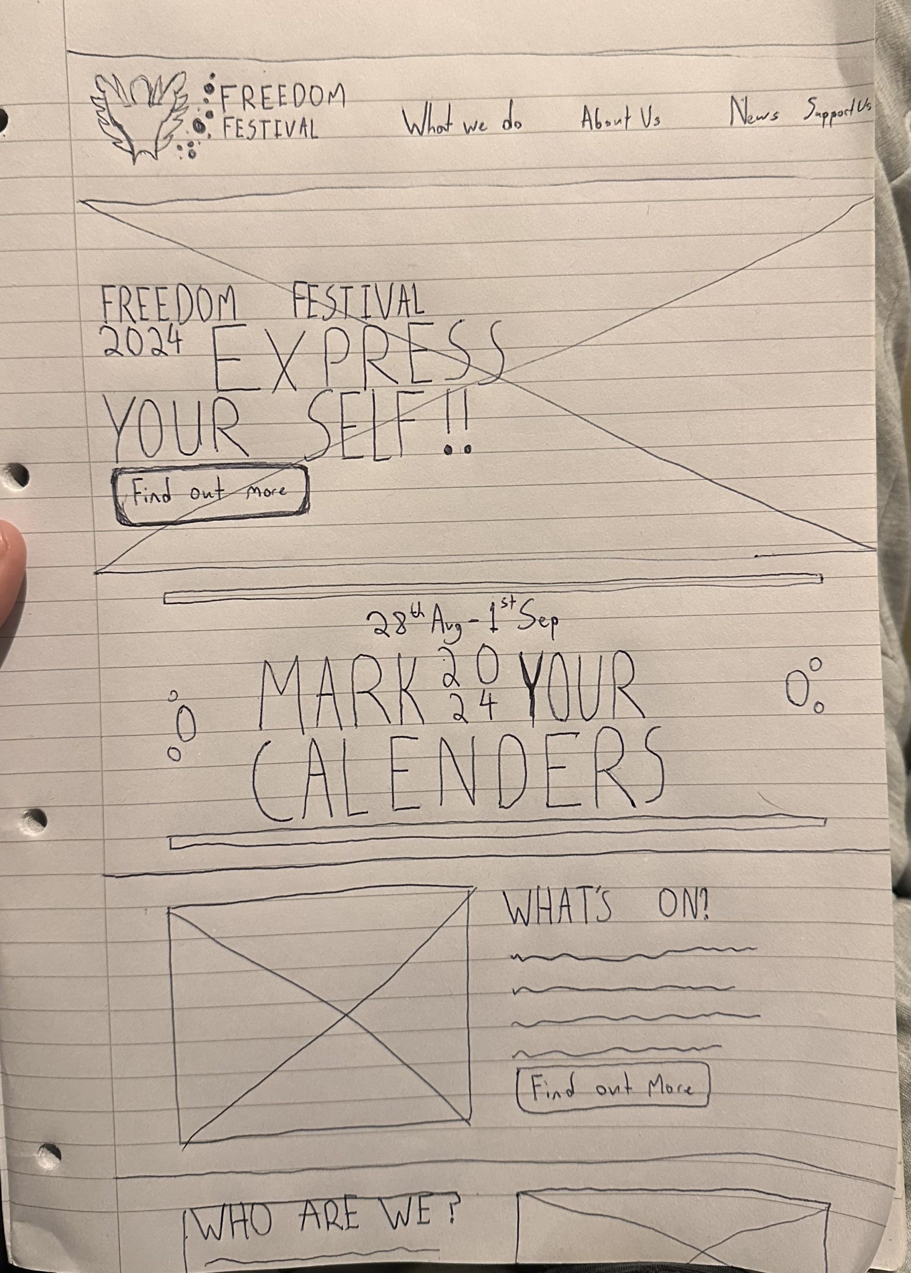
The first step to any good wireframe is the hand drawn stage this part is crucial to the design process as it allows quick revisions of ideas without the limitations of software this means heightened creativity acting without limits allowing for more free flowing stream of ideas perfect for this initial stage. The next logical step from this is moving the design into XD one of the best wireframing/prototyping tools on the market. There are many parts to wireframing that to designers may seem self explanatory but to others are not quite as clear. One of the most common being the Symbol for images, essentially just a box with a cross through it, this could represent any media item that would take too long to render out on a page but needs to still be included. Another common item is the wavy line representing Body text, often at this stage most body text is either undecided or just too long to write out in a prototype and therefore designers turn to wavy lines to represent these texts and the space on the page they may take up.
Wireframing Basics
Once completed roughly on paper it becomes time to digitise the design, at this point you may notice certain details don’t translate as well digitally as they do on the page or are difficult to achieve, this is the stage where it’s important to figure out these problems and find potential solutions in order to move the design forward, its also important to consider how elements work in other formats/form factors, i like doing this at the digital stage in XD as the preview option helps visualise the scale things should be when on mobile. This is an issue that sometimes occurs when starting from a mobile drawing it’s difficult to imagine how large the screen size is in relation to the content/layout you create.

Responsive Design
An important aspect of wireframing is considering how your design will be morphed when placed in different form factors, a designer needs to consider what needs to change, are some images not needed to get the point across? How will some web elements translate on a smaller screen and how can interactive elements work with the smaller form factor. These are all questions designers need to ask themselves in order to achieve a responsive web/app design layout. When doing wireframing we also need to look at how different text sizes and weights work at different screen sizes, as sometimes a large title which may work on the bigger web screens takes up too much room on a phone screen becoming unreadable.
Layouts
When creating a wireframe the most important element to consider is layout, the way elements on a page interact, form together and how they read to the user. Its also important to consider the hierarchy, what the most important information on the page may be along with how you can make that information stand out from the rest leading the viewer on a user journey through the page orchestrated and constructed by you the designer. When looking at a page even in just wireframe form it should display a clear hierarchy of information drawing the user to click further into the website/achieve the goal of the page. This is why establishing a goal for a page is extremely important as it significantly impacts the design process for a page.
Another important layout consideration when wireframing is the columns, its been well researched that when text is touching the side of a page it becomes difficult to read, especially on smaller form factor devices, media content is the one caveat to this as it can reach the very edge of the page and still get its point across without affecting the page. Therefore when designing its imperative that the text is well aligned with these columns, not touching the sides and matches the general column lines of the webpage as without it the website looks unprofessional and becomes harder to read.