Environmental Brand Applications
Some look at Environmental media as an outdated concept however in this post i will be talking about how it could actually be of great benefit to the freedom festival.
Billboards
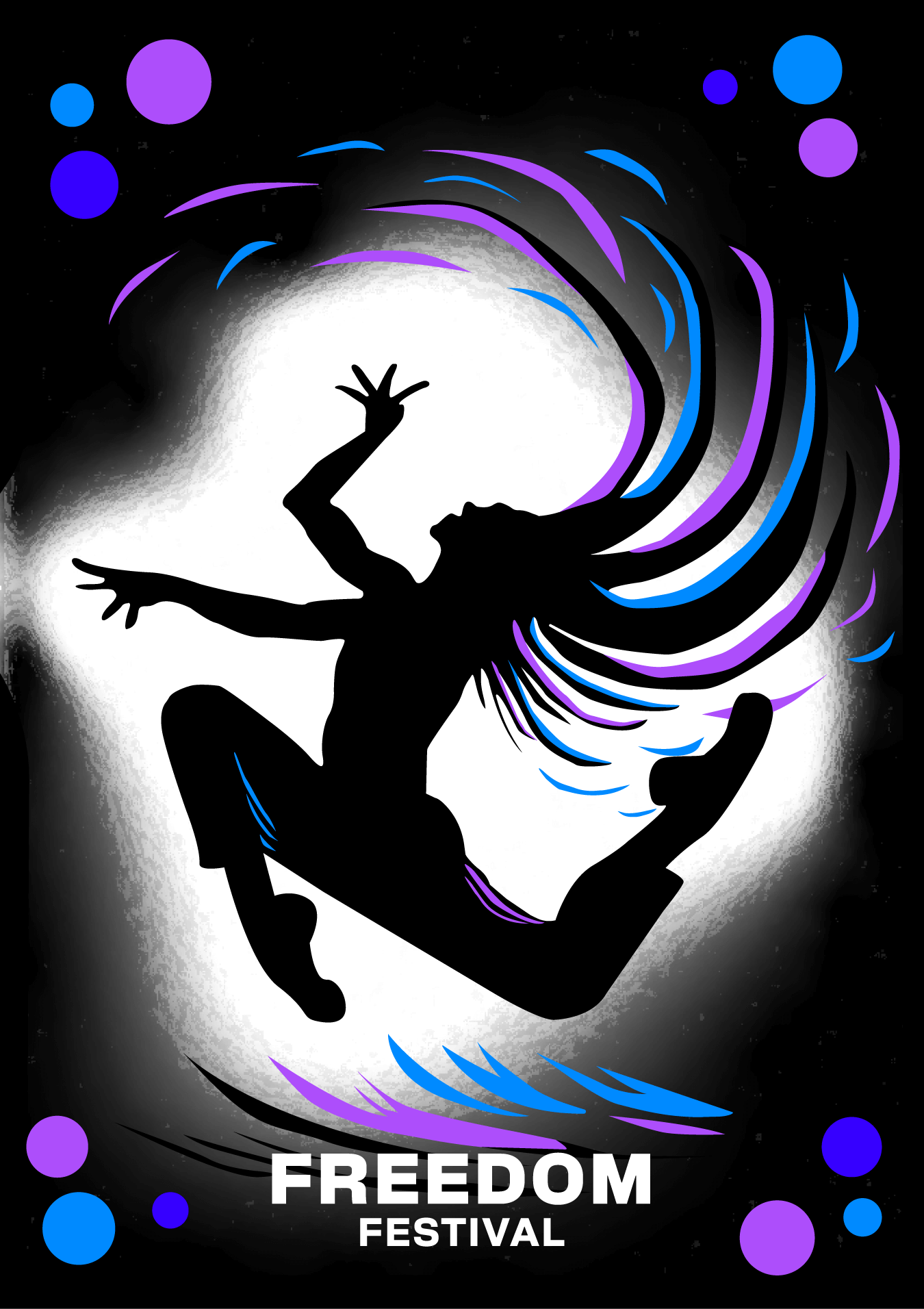
When you think Environmental advertising the first thing that comes to mind is billboards, these are often large sometimes digital ways to actively get a point across to all passers by. Billboards are big, bold and make a statement, therefore they need to be snappy and easy to remember, especially since a large majority of the people who see billboards are passing by often going somewhere in a rush, people dont have time to pay full attention so its important to be memorable, similar to short form content you have to design for the short attention span, grabbing attention where you can. Therefore when designing this I decided to keep it simple, displaying clearly an eye-catching image and below it a simple title of what its for, easy to read and remember for the high traffic that would pass it. The aim here is to spark someone’s interest just enough to get them researching what the festival is at which point the online presence becomes crucial for a seamless experience.
I chose this particular pose to recreate due to its high impact nature, it should appeal to all ages of audience and showcase the main point of the festival Freedom, and being free to express yourself as i’ve attempted to illustrate using the brand colours in the accents escaping the hair like they are free themselves. The intention behind this is to appeal to peoples inner struggles allowing them to break free and see the light, i also illustrate this using the background light which seems to almost escape the billboard itself.
In practice i imagine this to be backlit at this point in order to fully emphasise the breaking free from boundaries and expressing yourself point as it aligns perfectly with the brands image.
Posters
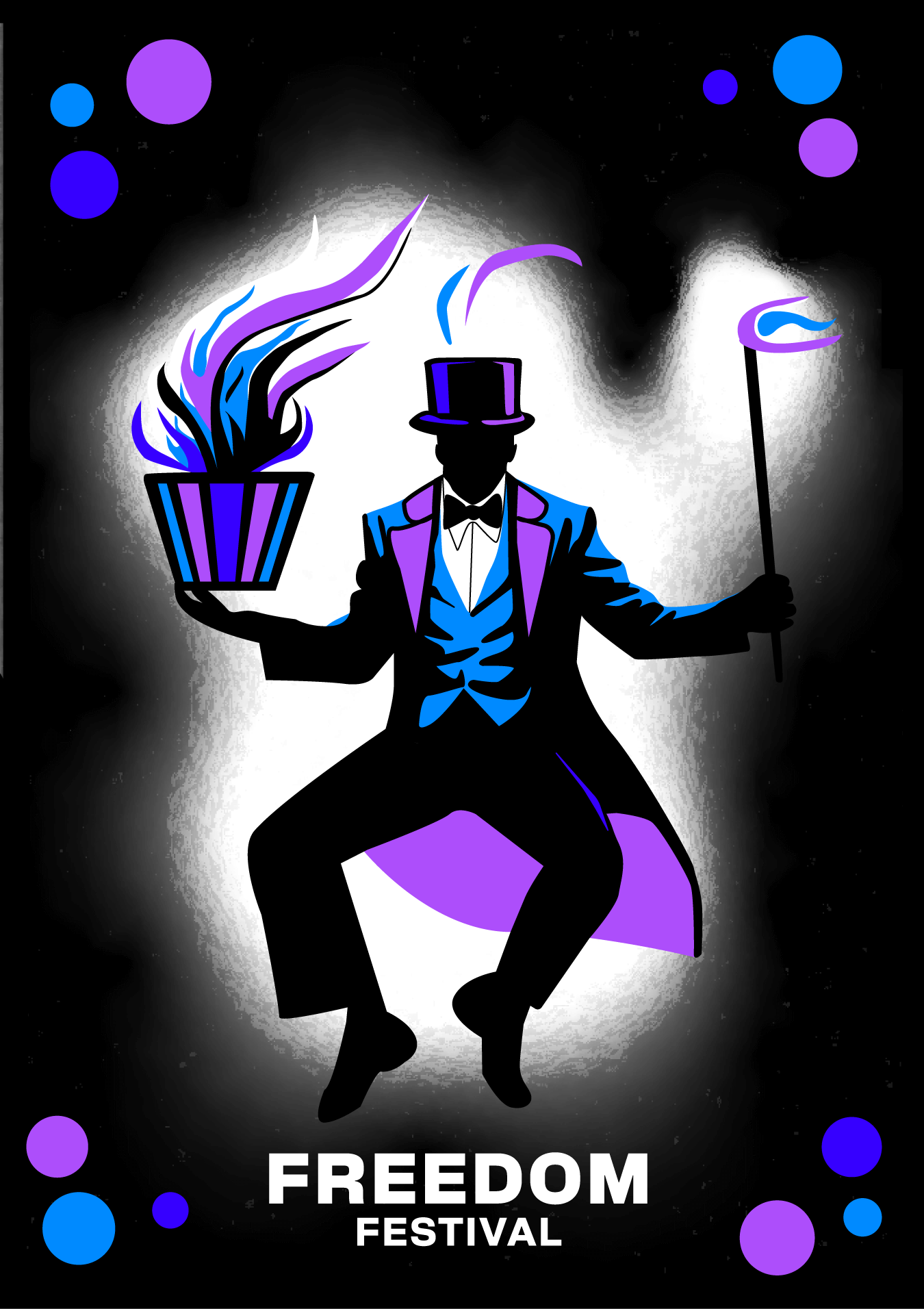
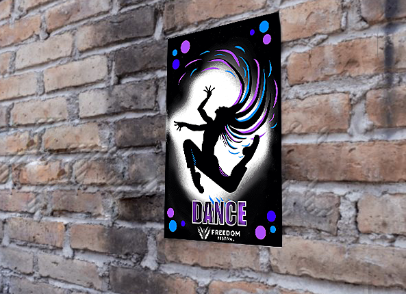
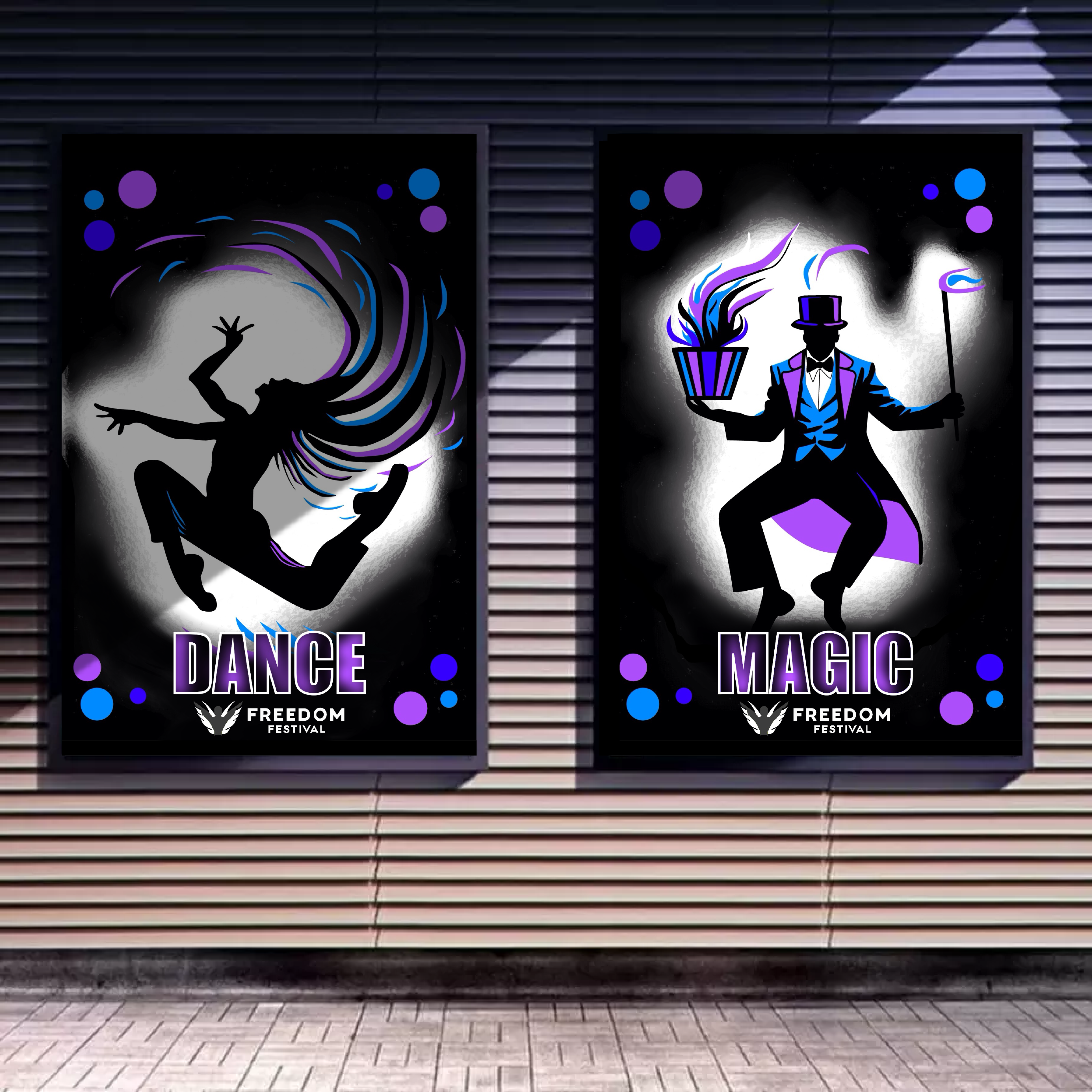
Posters on the other hand are more personable, their ease to put up and smaller scale allows them to be used more versitally in different relevant areas, it also enables the brand’s image to be put in front of people on a more personal level allowing the brand message to hit harder and clearer in some cases. Their versatility also allows them to be easily replicated and made more frequent, opening up the “death by a thousand paper cuts” approach to marketing, where the brand becomes so commonplace it becomes well recognised merely because its seen so often when roaming around in the world. When it came to changing the designs for posters i decided to change the text to include basic words to help further illustrate the type of events that would be happening in the festival, i imagine all event based posters would be put up into a line allowing the viewer to walk past normally while still picking up slight bits of information about whats on at the festival. I maintained following the idea that most people would be too busy to look too closely into the posters as they pass by but based on the small size it does allow for a slight bit more information to be displayed to the viewer when in passing. When it came to creating the magician design i tried to continue following the brand identity matching the essence of the first poster design by creating another silhouette that captures the imagination/attention of the viewer, and what better act to present that way except the magician. The posters would work best placed in areas of high foot traffic along with near the space the festival will be taking place in. In order to be fully effective its always better to have them placed in areas where people who may be more inclined to be interested attend for example a good way to find out this information is through polls on the pages social media, asking the people who are actually interested to get involved and help pick places to put the posters not only keeps old participants engaged but also helps new participants find the festival.
