Freedom Festival Website Redesign
My Redesign
The Freedom Festival, being a performance art festival is all about expression, expressing how you feel and allowing individuals to make their mark. I wanted to capture that vibrancy in my redesign while also maintaining a professional atmosphere on the website in order to appeal more to adults. In this page ill go through the process that led to my final design the thought behind it and how it matches the goals for the overall Rebrand Campaign.
Design Philosophy
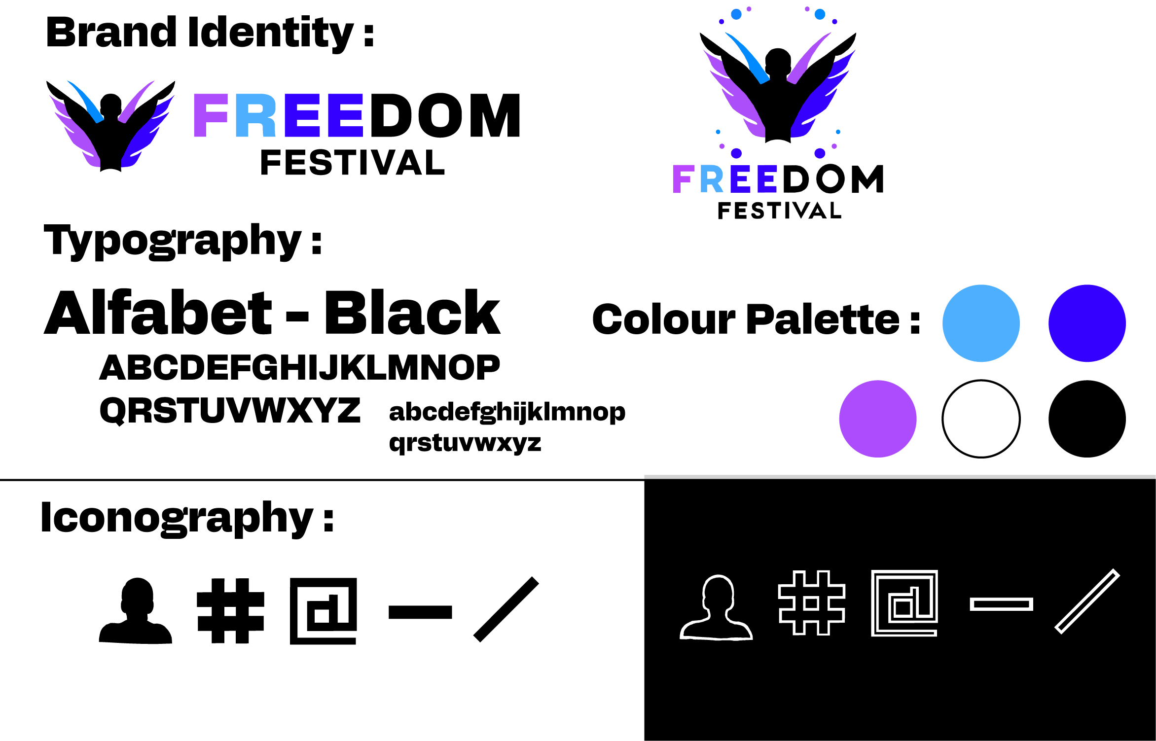
When it came to actually designing the website the first thing I looked at was the Brand Identity I created for the redesign, it was highly important to me that this matched in order to make the whole redesign feel like one project no matter what its applied to, the idea being if you saw a piece of media from the Freedom Festival it should be instantly recognisable if your familiar with the brand. I also wanted the webpage to reflect the individuality and freedom of expression intended to be the new brand message, this proved to be a challenging task when also aiming to be less tailored for kids and more adult focused in an attempt to make the festival more appealing to other demographics.
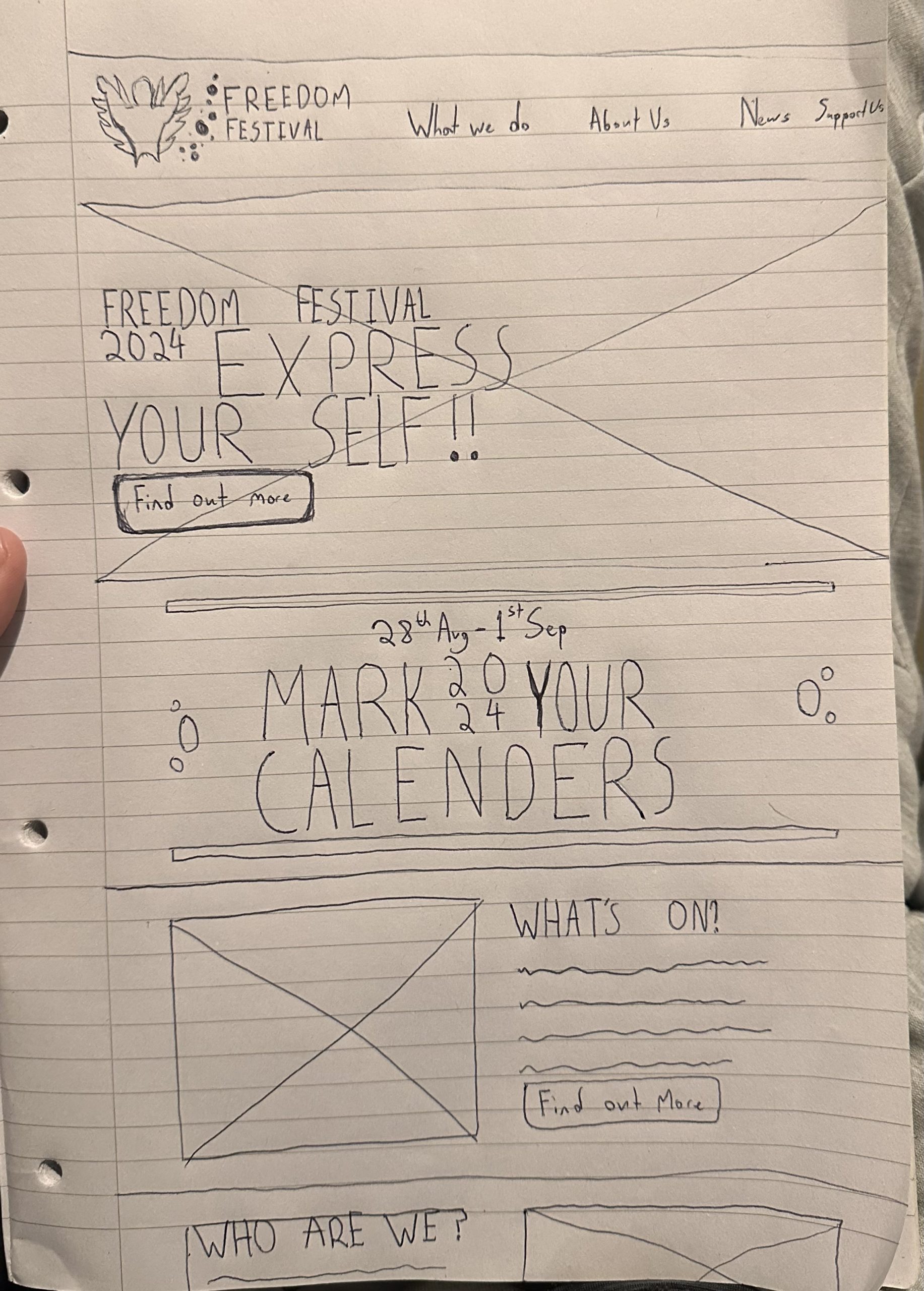
Initial Sketching/ Wireframing
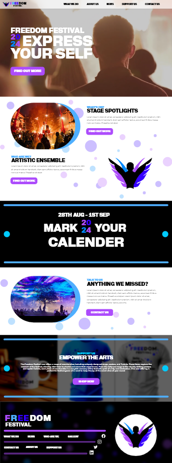
For the website layout I opted to go for a main Hero section which I imagined would have media playing in the background. I left aligned it in order to make sure it draws the most initial attention from the person landing on it, this is an assumption based on the idea that people read from left to right so it only makes sense a users first point of contact would be left aligned text. However in order to emphasise this further i decided to experiment with the title and year in order to make it more interesting and draw more attention towards the date. This achieves one of the main goals for the site to inform the user of the key festival information in a memorable and interesting way. I also at this point started considering the mobile version for the website and how the wireframes would translate to the smaller form factor. The conversion from web to mobile often leads to some interesting solutions as it forces the design to prioritise important information and display media in new ways in order to give mobile users a similar/ the same quality of experience when using the website.

Visual Elements
When it came to the final prototyping stage I established more clear visual elements that are reproducible around the website and also match the design aesthetic for the brand. One of the main themes for this being the continuation of the circular ‘bubbles’, from the main logo idea, in the brands colours. These are strategically placed and turned down in opacity to not make the page hard to read. Continuing the bubble theme the image cards are rounded with a brand coloured shadow on the right side in order to make them stand out on the page without the clutter of a regular outline. I Also decided on a “2024” design which i reproduce both in the Hero section and the date section to emphasise its importance and further establish a brand language to follow.
Engagement and Navigation
In my design i also incorporated a social media link area in the footer that will reoccur on each page encouraging users to share their experiences of the freedom festival with their followers in order to promote the event further. This is the modern version of the powerful marketing strategy word of mouth advertising, as it has evolved over time social media now plays a crucial part in how people interact with each other so its vital the freedom festival capitalises on the users ability to share and talk about the festival on these platforms, the easier the better.
As for the Navigation I simplified it slightly, reducing the amount of page titles to the more important ones in order to prioritise the more relevant information making it clearer and more accessible to visually challenged users. i made sure the menu was sticky so at any point scrolling the page the user can access the pages they want to see and for ease of use i implemented the logo sends you to the homepage feature as it ties into improving the user interface for the website by following the trend many websites do allowing the user to instinctively know the logo takes them to the main homepage.
Responsive Design
Alongside creating the main design every step of the way i worked on how to implement features and layouts on the mobile form factor, this proved somewhat challenging for some of the larger elements however by thinking of how it would translate from the start the process became quite easy to execute, the smaller form factor sometimes requires elements to be moved and reconsidered in different locations or not displayed at all in some rare occasions The goal i had in mind when designing the website for mobile was to give the user the same high quality experience and information as the web users allowing them to enjoy and get excited for the freedom festival without being limited by the device they are using, this is where responsive design is most important especially in a world where most people browsing the internet now do so through mobile devices.