Responsive design principles
Responsive design is a key concept for all modern web designers as it has become almost a requirement for brands to have a responsive website with most people turning to their phone for online browsing over a traditional computer. For an Event like an art festival, it is best to have some sort of responsive online presence whether it’s an app or a responsive webpage. This is established even further when you look into how an event uses word-of-mouth advertising through shares on social media platforms which hold a majority small device/phone userbase so all potential attendees finding the event through this means need to be able to access the information and experience the website as intended in order to get the most out of these platforms.
Core Principles
Simplicity – When it comes to a responsive design you need it to be concise in the information it gives, cluttered designs can become almost unreadable when moved to mobile therefore it’s crucial to not overcomplicate a design without considering how it could be adapted for mobile.
Adaptive Imagery – Upon looking into making a design transfer to mobile it’s important to consider the need for images, some designs can benefit from making certain images only appear at certain form factors to reduce clutter on smaller screens. For example, a page that has say 3 images in a row on the web might reduce it to one image for mobile or if the images are particularly important they might use a looping carousel to display them one at a time.
Readability – When considering Font choices, text sizes and layout it is important to keep your design readable at all form factors, for example, a large title might take up too much room at smaller sizes, this is where text sizes like rem become helpful as they can scale with the page rather than remaining the same no matter the form factor.
Spacing and Padding – The space on the exterior of text and web blocks within a margin is called padding. Adjusting this padding on the side of the text element can play a crucial role in its readability, especially since it’s advised, that text should never touch the edges of the screen on any design as it decreases readability. It’s important that this padding stays consistent across the whole webpage to keep the design feeling more intentional.
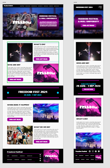
For the Freedom Festival website, I’m considering all of these principles as you can see in my mockup. It’s important to look at the side by side of these designs and how one compliments the other remaining the same while adjusting to prioritise the information that’s more important to the smaller form factor. One noticeable change to the content is the Freedom Festival date information, I redesigned this part in order to reduce clutter and adapt the information to be more readable at first glance. As well as following the principles I laid out this also has the added benefit of making the design easier to passively scroll through without missing the important date information, I did this based on my own assumption that phone browsing users pay less attention to the small text content only reading further if something piques interest. So in order to combat this I made it stand out in a large attention-grabbing bold white in covering a large portion of the small form factor screen to maximise the attention called to it.