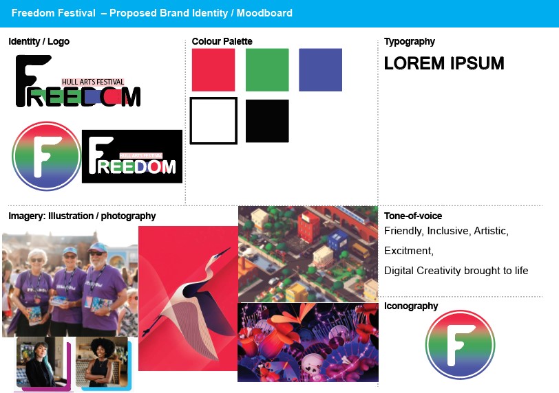
Conceptualization of website design
Conceptualization of website design, including layout, color schemes, and typography.
My Initial Idea / Colour choices
Initially My idea for the Freedom Festival redesign was in a similar direction to the original keeping the typeface logo but changing it to make it different, the goal being to make the brand less childish as with the current brand image the illustration style leans towards a kids event rather than an event for all people as it is intended to be. The problem being it does have to market to both kids and adults being an inclusive event it needs to be visually appealing to all age groups. So in my first attempt at a redesign, I chose a colour palette of primary RGB colours. This was inspired by the changing art scene as digital art takes a more recognised spot in the art community, this is a symbolic change as in my research of the Freedom Festival they tend to use more traditional print friendly colours for their designs so they can print posters and such for advertising. This is less important in a modern space as digital advertisement boards at bus stops and popular locations become more widespread.

Layout
Looking now towards the layout Im going to go with the most popular layout for these types of websites, a grid split between different pages accessible from the sticky main menu and with a helpful footer to help find the correct pages, the menu will be split into sections like it is on the current website of which some will dropdown to other menu items. I created this graphic to show how this layout could look and how it would change to adapt to different form factors. This particular design is heavily inspired by the current design for Freedom Festival as at this point in the development I have not established a new brand identity for the festival. However, it is good to use this to show the parts of the website I believe worked well such as the accent-coloured subheading above or below a title I chose this as one of my favourite elements as it highlights important information while remaining subtle and matching the theme of the website.
Typography
Turning finally towards Typography some of the main elements I’m going to focus on are messages I want the typeface to show, for example, if I chose a more rounded typography approach this could be interpreted as a soft approach but if I were to go for something like The IMPACT Font it would give off a more aggressive message to the reader. For my particular use case in an art festival website, I am looking for a font that isn’t too formal or childish and easily legable to any reader a good font may, however, I do not want to use a heavily used font as the idea behind the festival is creativity and therefore, the best option is either creating a custom font family or going for an established font family that matches the requirements for this project. It is important to note that In a real project, this may not always be an option due to copywriting laws on the use of other people’s fonts for commercial use, It is something you’d have to work out with the owner of the font property if it’s not free for commercial use.


