The idea that I’m going for is a brand focusing on the advertisement of fantasy films in this case focusing on a specific film trilogy. The target market is appealing to here is fans of star wars and similar films looking for the next thing to watch, tailoring towards teens and young adults in this category.
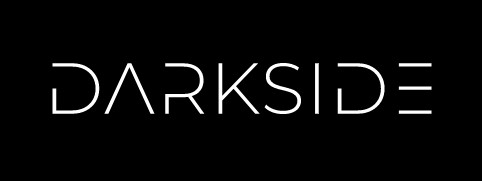
I started by finding a good font to use eventually settling on the “Montserrat Light Alt1” font style for its modern, creative capital letter designs in an attempt to appeal to the target audience of teens and early adults.
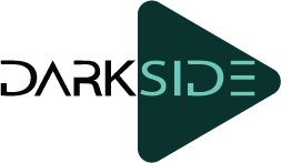
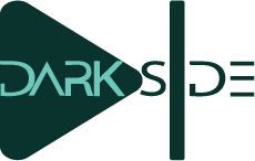
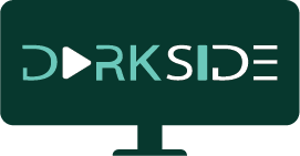
I then began thinking about what to call the brand eventually settling on “DARKSIDE” for its familiar feel, the subtle connection to star wars, and the overarching idea of Good Vs Bad which I can apply to inform my designs later down the road.
Unfortunately, I had issues with this font leading to me doing the next best thing and replicating it for the logo hence there may be some small details different in my design but the concept/ style shall remain the same.
My Conceptual Idea's
Brush painting Bullseye
This could replace the D in the logo appearing half-finished to resemble the shape, potentially resembling that the magazine looks into how movies are made.
Fast forward/Play icon
This could replace the A in the logo with one half while the other is in the background linking the idea of watching the process from A to the other side and a speedy delivery of content.
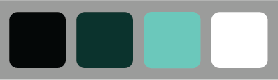
I chose this color palette of a contrasting muted green with a bold interchangeable black or white as it speaks to the loud nature of modern content while still upholding the modern feel when looked at
Colour Palette
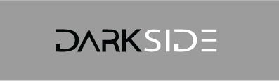
"Dark-Side" Separation
For the composition of my logos, I went with an intentional separation between the “DARK” and the “SIDE” in order to invoke the idea that it represents seeing both sides of movies, such as the finished product and also the behind-the-scenes. this also ties in quite well with the actual name of the brand I chose “DarkSide” as it uses a two-word combined style of brand naming plus both words are 4 letters, therefore, making it easy to separate.
The Design Process
I started by just putting my ideas into a solid form one for each in order to decide which one worked better so I can choose to work towards the best idea of the two
Brush painting Bullseye
Fast forward/Play icon
I decided against the extra part within the a working on the design from there…
This was my attempt at linking the concept of the next button to the design which I still believe works fairly well at putting across my point/idea.
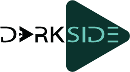
My Final Design
For my final design, I decided to keep the next button shapes changing their colour to match the other side in order for them to stand out and linking them all together by adding a background shape representing a tv screen
Important Note
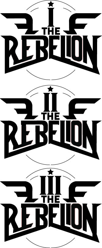
The Typography/Logos shown here are the main title typography design for each of the films in the trilogy, media companies producing films often don’t just use their logo but create custom-type logos for their shows/films hence leading me to the conclusion it would be better suited in the typography section of the development log.