Illustrator
self portraits
My First try at the Portrait
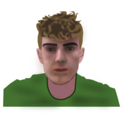
For my first attempt at creating a self-portrait in Illustrator, I initially approached the task with realism in mind, attempting to replicate the details of my face and features by using a lot of shapes that were blurred together in an attempt to shade in the correct places. I wanted to achieve a semi-lifelike appearance of myself in the portrait. However, as I continued to work on the design, I quickly realized that this approach was not the best way to create a self-portrait in Illustrator this is due to one of the main challenges I encountered; the complexity of trying to create a realistic portrait using shapes and blurs. The process of creating each individual detail and trying to blend them together to form a cohesive image was very time-consuming and required a lot of precision. In order to get a portrait to look realistic, all of the details would need to be perfect, which left very little room for creative freedom and experimentation. As I continued to work on the design, I began to realize that a more simplified approach would be more effective. Instead of trying to replicate every detail of my face and features, so I just tried to focus on capturing the essence of my appearance rather than continuing the realism.
Portrait 2
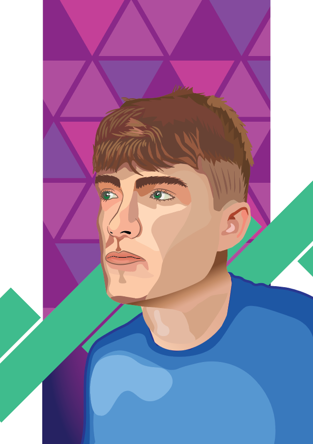
In my second approach, I started using shapes (similar to the first attempt but without the blur effect) to approximate the highlights and shadows on the face, this ended up working quite well as the face became more recognizable than before. The hair was a similar story however toward the ends I used thinner shapes to mimic the focus point and provide more texture to the hair. For the composition and conceptual design elements I decided to work on the background using basic shapes to separate it into two sections: a colorful triangular background and a plain white void around it. This was to center the portrait in the middle, popping out of the frame, but also to set up my conceptual idea of breaking boundaries and thinking out of the box. I decided on the (value-increasing) green bars due to my interest in becoming financially successful and my fascination with trading the market. I spaced these all out consistently and sideways to lean into the idea of it being a steep hill to becoming successful.
