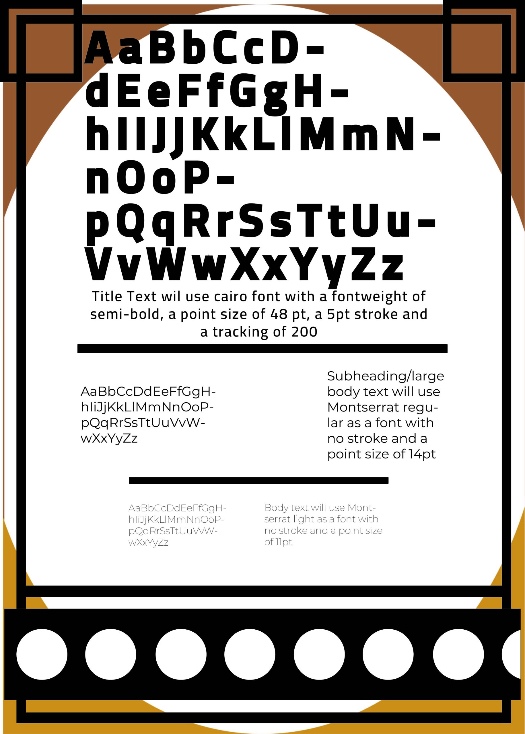
The first Typographical standards page is primarily going to be uses for the advertisements (Editorial design pages) Showing the main font for titles as “Cairo” alont with its point size, stroke and tracking this is to make the creation process easier to follow if somone were to want to create another following the same design standards.
I used “Montserrat” regular and light for other smaller text options as a subtle nod to the Main logo text of the company behind the imagined film trilogy which uses “Montserrat Alt”.
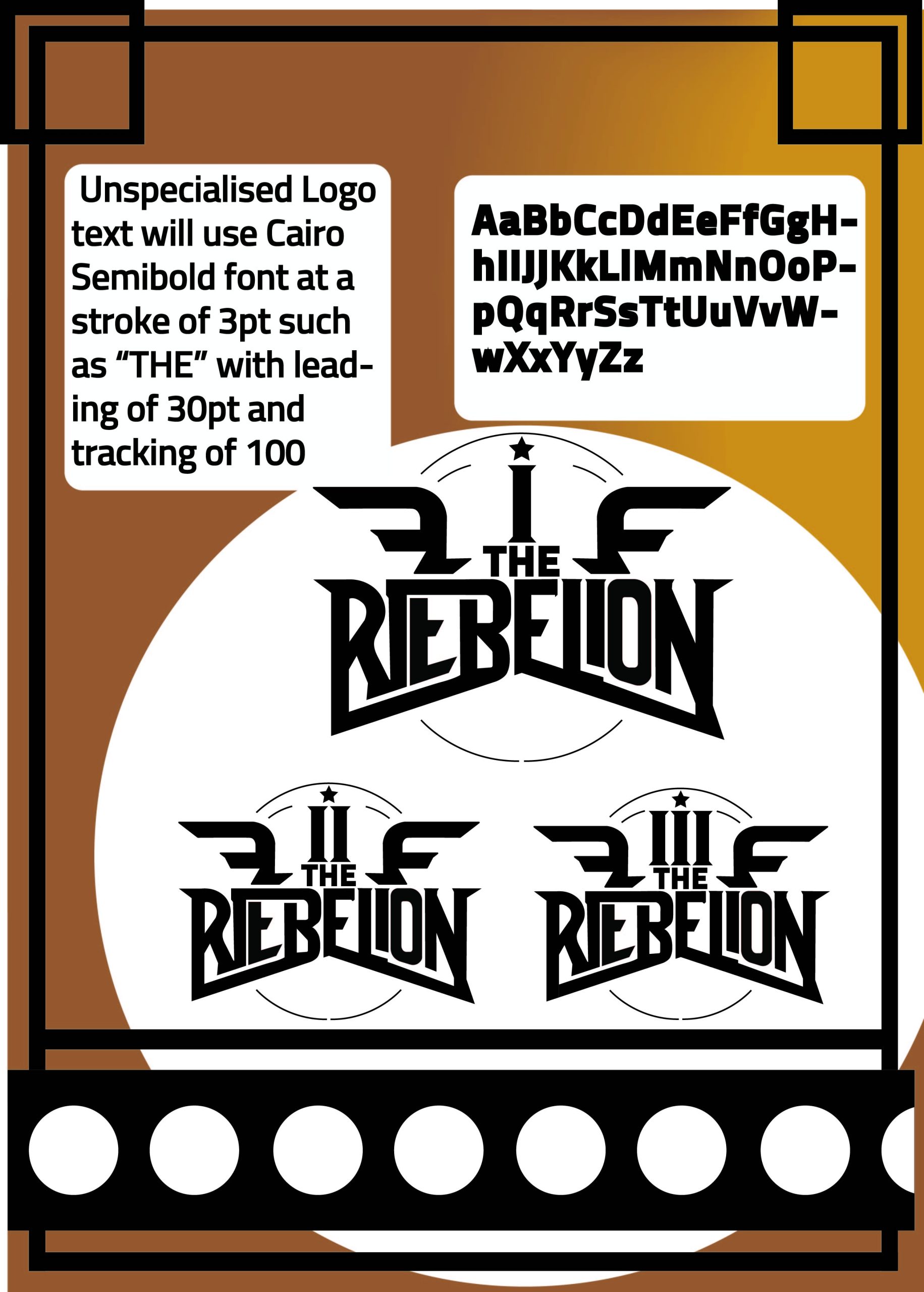
The purpose of there being two logos Both DARKSIDE and THE REBELION (as seen in these typography sheets) is so the company brands the films with Darkside as they are the production company then uses the custom type for each film title, for example, Disney+ place their logo in all the promotional material of all their projects yet also include the custom type title for the show/movie both in the same design. I chose this type of typography for “THE REBELION” as it gives the feeling of a Military patch but also presents as not very refined which fits perfectly with the idea of a rebelion. I also included a star and shapes resembling wings in order to further give it a military patch look.
The typography also bends in order to almost break the mold which also relates back to again the themes of the movie trilogy bringing to life the idea of breaking off from the norm and rebelling, fighting back against oppressors, which are the themes I wanted to explore with my designs. I took this a step even further as I realized a spelling mistake after completing the design, id put in one L instead of two, but due to the spelling of Rebel and the meaning being both to Rebel against something and singular for Rebel, I realized that this could be reimagined as an intentional design characteristic, turning a mistake into a feature representing how a rebelion starts with one or two singular people who choose to go against the norm.
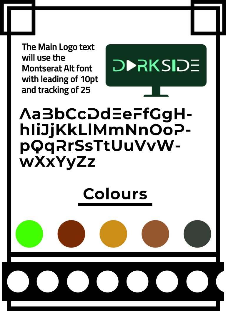
The final text I dedicated to the typography of the Company logo I designed in the masthead logo design post, For this, I went with Montserrat Alt as it embodies the kind of modern stylized design I wanted to go for, just slightly increasing the font weight on the I to increase the thickness so it (along with the Play icon) slightly resembles the skip button found on most media content websites further linking it back to the overall conceptual design of the logo. I also decided to include a small section about the colors I could use in my designs, these were chosen both for the visually pleasing aspect of nature and the overarching meaning of natural balance, linking to a main aspect of the storyline for the trilogy of films, the shift of power between the bad guys (the Conglomerate) and the good guys (The people/the rebellion).