Self promotional
Image
My First Poster
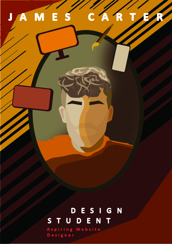
For my first Self-promo poster, I wanted to include my face or at least something that resembled my face within the design to reinforce the “self” part of the poster, but also to make it more personable due to the target audience being employers, as people often prefer putting a face to the name when looking to hire. The first step in the process was figuring out a color palette, so I ended up deciding on slightly desaturated reds and oranges both because burgundy is one of my favorite colors and due to the sense of warm urgency they give when I look at them, which is exactly the kind of emotions you want employers to feel about hiring you almost a ‘Get them while its hot’ type of feeling. For the typography, I used the Calibri font with high tracking to illustrate the wide range of challenges I would be able to deal with, making it follow the composition toward the bottom of the poster to lead the eye down the page smoothly, I used a wide variety of lines in the background to illustrate the speed I can get work done under pressure, I also included some conceptual elements in the form of devices with screens as this subtly links to one of the key concepts of modern web design; responsive designs.
My Second Poster
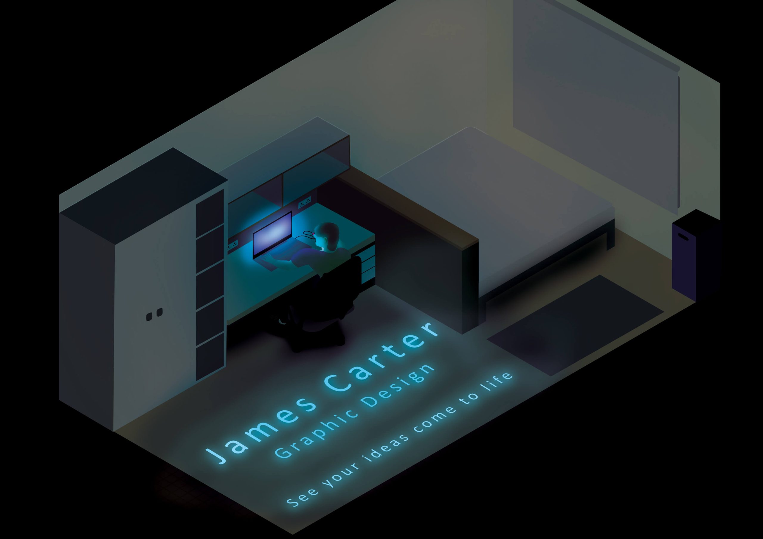
For the second design, I took a very different approach, going for a more surreal realism so I decided to depict the room around me as I did the design. This was a very interesting idea to pursue as I had to work with the perspectives associated with the real room from that angle, for me this plays the role of connecting myself to the design while also being general enough of a space that it could represent anyone viewing my design, which is a powerful prospect. So conceptually it links me and my situation to the average viewer sitting at their computer to push the concept of ideas breaking free and being used in the real world, hence why I included the “See your ideas come to life” typography at the end. For the typography, I placed it laying on the floor with a neon-ish glow to it so it sticks to the ‘ideas coming to life’ narrative.
