I started this by simply drawing some ideas onto a page of layout designs I could go with just rough sketches of whatever came to mind, eventually settling on using text in the shape of and around certain elements to create some intrigue and differentiate my designs from just plain copy and images.
My First Sketches
The main idea being to relate them by using reoccurring elements such as lines or shapes which could tie them all in together, or potentially could even be used to make the design pages work together to make a larger image almost representing seeing the bigger picture. Which works both literally for its meaning and figuratively as movies are watched on bigger cinema screens. To Relate these editorial pages to my final cover designs I’m going to attempt to continue on with a similar style to the cover designs, maybe tieing them together with an overarching theme of some kind this could be Shapes, Lines, Style of Graphics, etc.
Words to help with inspiration
Freedom
Exploration
Morality
Balance
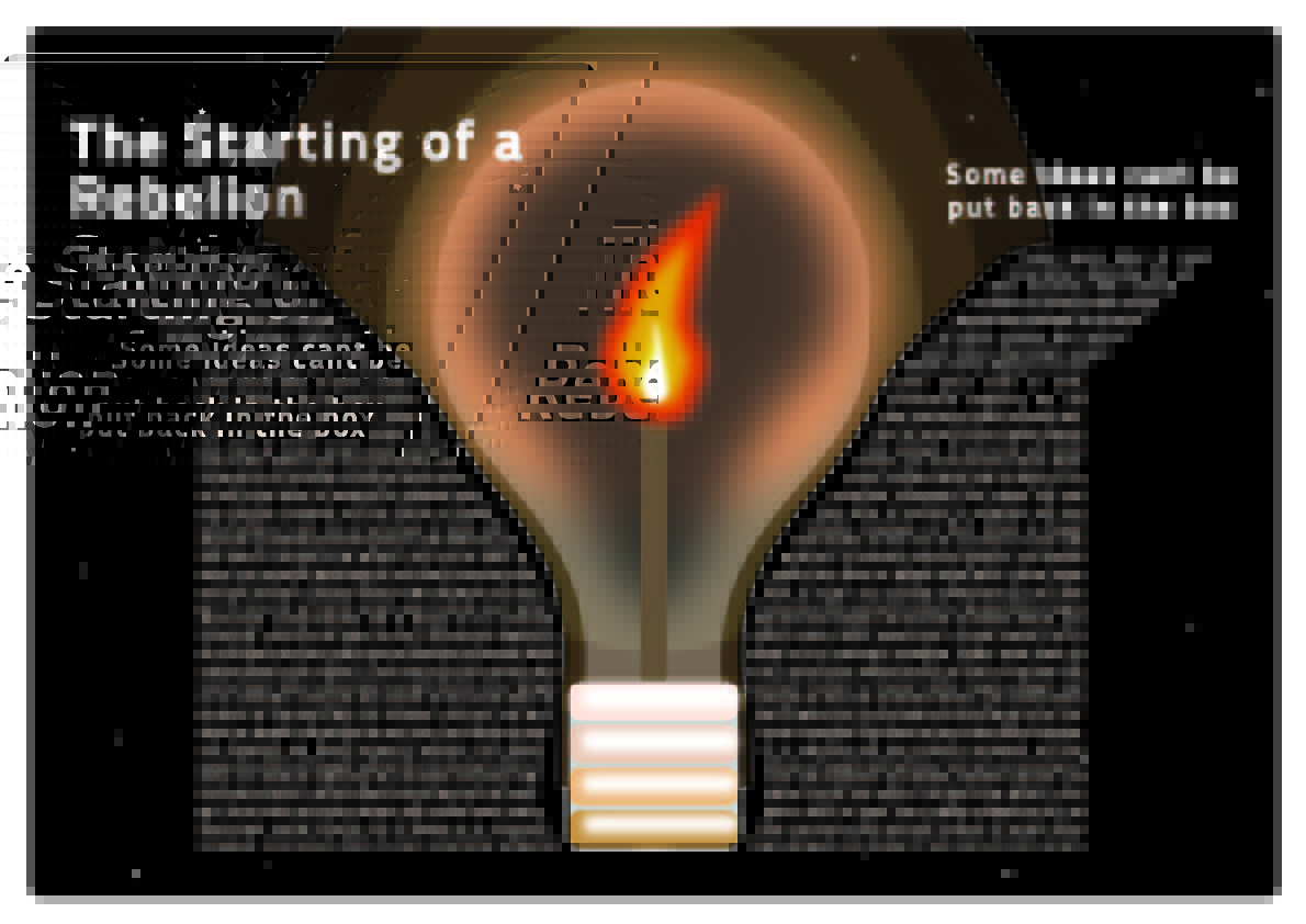
Rebel
My Designs
Design 1
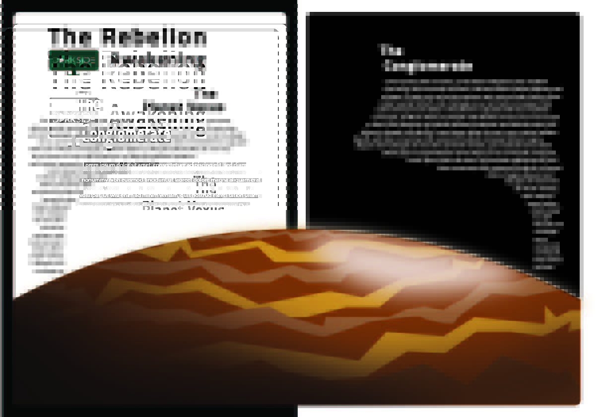
In my first design, I developed a Master Composition using a white block on a black background and black on white background, I did this in relation to morality and balance bringing inspiration from the yin-yang symbol and its greater meaning of good being in bad and visa versa creating balance in the universe, which is a truly beautiful symbolism that I resonate with quite well and wanted to include in my designs. For the first design, I wanted to create a sense of scale which ended up leading me to this design a simple planet with the text subtly outlining a figure in the background this is to imply the power the main villain “the conglomerate” has and its influence of everything in this case the moving of text.
Design 2
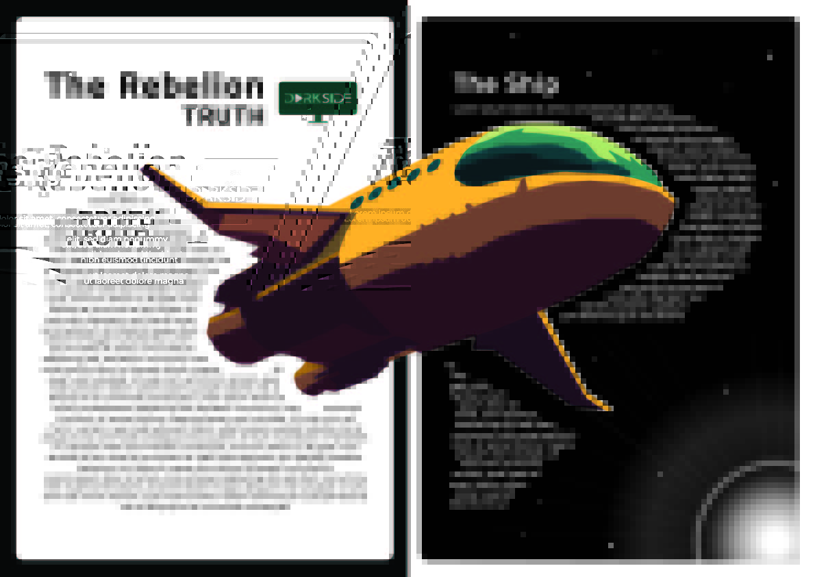
For my second design, I continued following my Master Compositional grid, as well as tieing in one of my original ideas of a ship flying through the pages, I did this by wrapping the body copy around the ship at certain points to illustrate the movement more clearly, as if it’s traveling at great speed. I also tried to follow the color scheme of oranges and some greens in the design to remain consistent with the cover designs it also incorporates some of the brands color scheme as a subtle nod to the production company.
Design 3
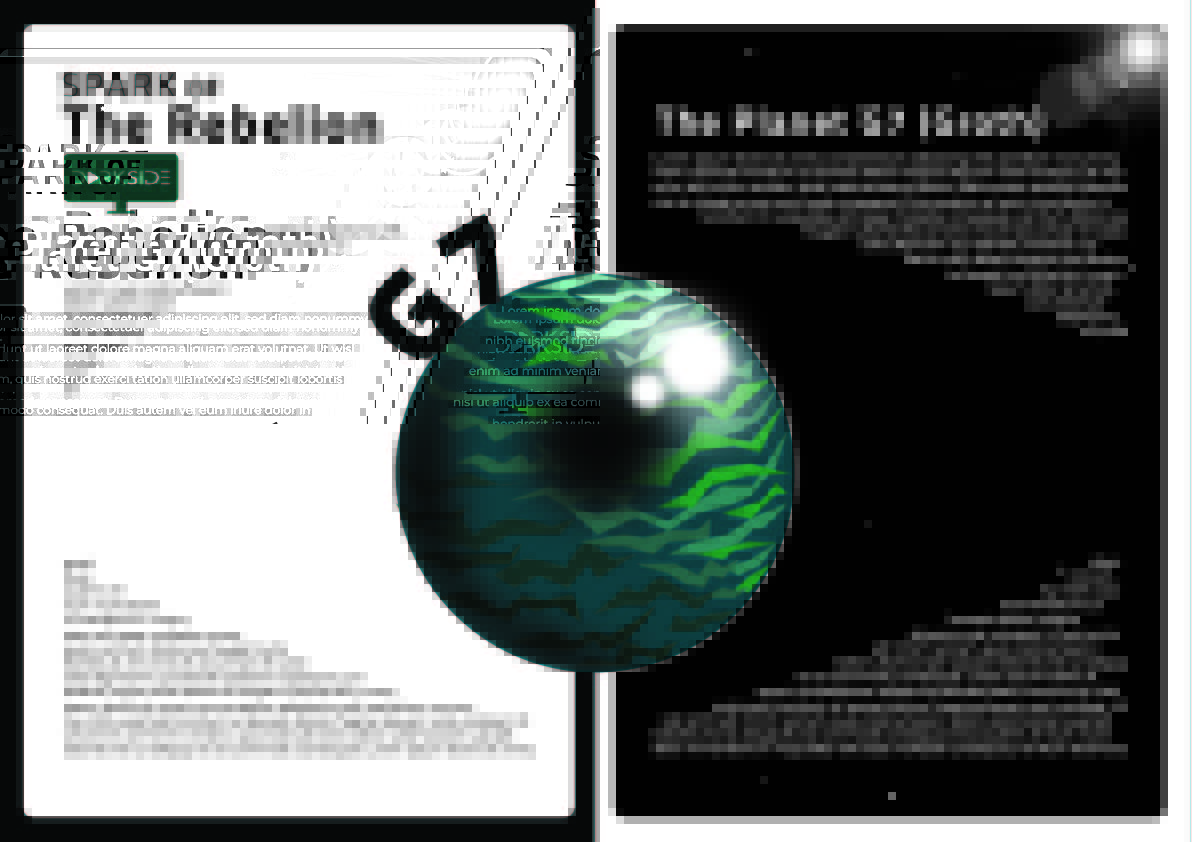
For my third design, I again went for the planet description topic for design, so I came up with the idea of using the planet as an eye as if the planet itself is watching the reader this should provoke feelings of unease, but unlike the very first design, this interpretation only implies seeing whats happening as opposed to control, linking to the overarching theme of the films, a rebellion taking back control from those in power.
Design 4
I wanted to mix up the composition a little bit for the final design, so I used an all-black background while still retaining the opposite (white) as a border. The Darkness suggested by this also helped me come up with the idea which started via the phrase “Some ideas can’t be put back in the box”. I found this quite relevant to the nature of a rebelion and how all it can take is someone willing to light the match (metaphorically) for people to stand up. So combining these ideas I used the text as a box shape with a lightbulb representing the idea and a flame lighting up the dark from within working as a makeshift lightbulb.