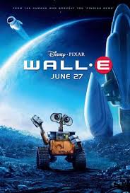
I chose the WALL-E poster as my good example for use of colour as it uses the blue to emphasise the cold industrial feel of space in the film. Blue is often also associated with big corporations such as Buy’N’Large which played a major part in the film, therefore the use of this colour could be in order to symbolise the slow and gradual takeover of big corporations. On the other hand the poster also contrasts this it with the warm colours associated with Wall-E, which could be a reference to the robots character in the film being caring and warm to everyone they meet as opposed to the cold feeling given off by all the other robots at the start of the film. The use of Red, Yellow and then Blue as a background also significantly correlates with the findings of Crozier, 1999 and Rose M Rider, 2010 who found that kids “stared longest at red, then yellow, blue, and green” Which precisely matches the colour order used on this design going from the title in Red to Wall-E in Yellow then finally to the background in blue. This makes sense given the films main target audience being kids. This also somewhat links to the composition as it emphasises the path in which the onlookers eyes should naturally follow if done correctly. I believe this was done intentionally in order to emphasise Wall-E’s character cementing him as the main focal point before thinking about the story potentially in an effort to make it more iconic and stand out more in relation to the film in order to sell more merchandise.
My Bad Example
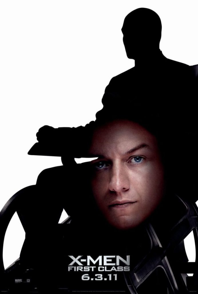
I chose this poster as my bad example for use of colour as it uses the very high contrast of black on white then incorporates regular colours for the face of the character/ actor, it could be argued that this was maybe intentional to draw the attention of the eye to the silhouette but if this were the case why include the face. Overall this is just a poorly designed poster both in consideration of colour and composition. Even the face doesn’t match the angle of the silhouette, or even attract the attention of the eye with its fairly toned down facial colours.
Attempt 1
Attempt 2
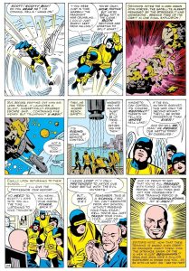
Comic Book Example Reference
My Redesign
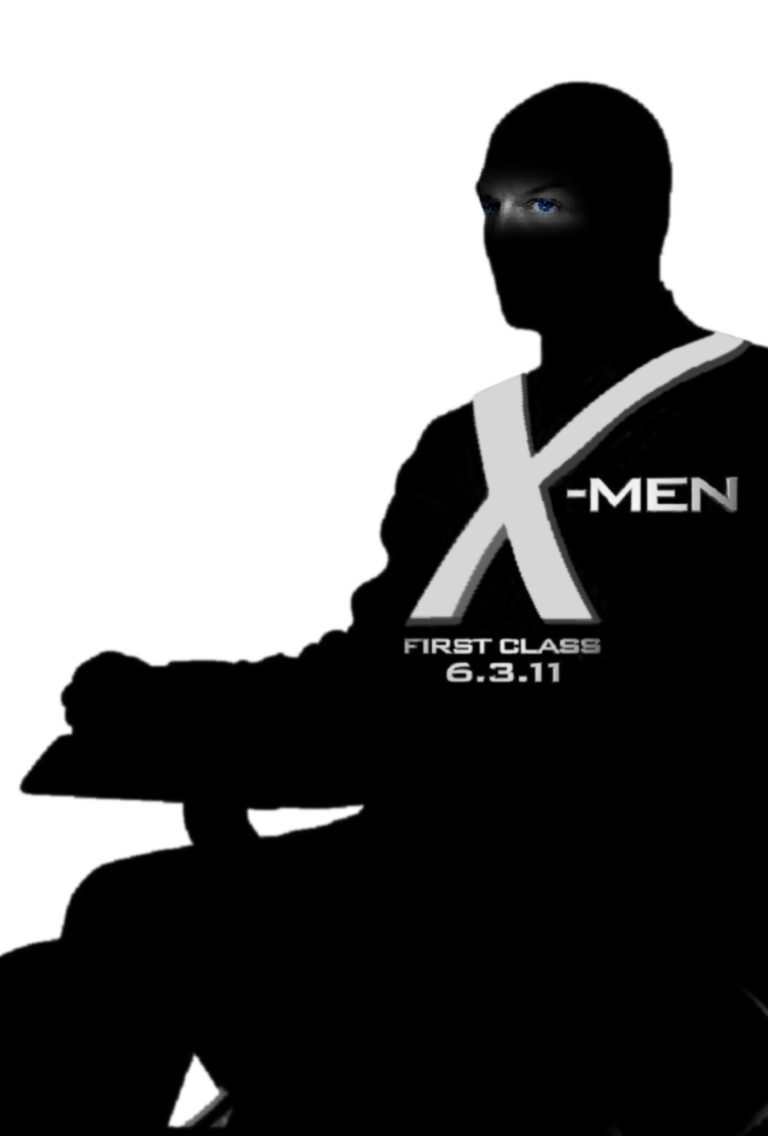
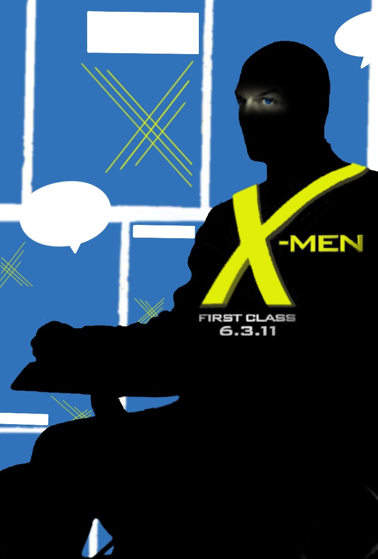
In my first Redesign I first chose to remove all the colour to lean more into the bold contrast of black and white to emphasise the character I then moved towards the face element deciding to simplify it to just the eyes since “the brain extracts key information for facial identification primarily from the eyes”(Science X (2009), with more research and better quality images to work with I believe this concept would work better. I then decided to move to a full colour route with my second attempt using the same base and changing it around to become a more comic accurate colour scheme which based on research referenced earlier (Crozier, 1999) are some of the first and most appealing colours to children which to an extent are a large majority of the target audience for x-men films. So in theory based on that research the attention should be drawn to the logo/title X-Men then to the surrounding area which I redesigned to resemble a classic comic book page such as this one.
Web Link –> The reigning king of psi: Charles Xavier Respect thread – professor X (n.d.) Comic Vine. Available at: https://comicvine.gamespot.com/professor-x/4005-1505/forums/the-reigning-king-of-psi-charles-xavier-respect-th-2032907/ (Accessed: November 3, 2022).