Key Terms

  • Kerning – The space between individual letters in a font
  • Tracking – To uniformly change the space between letters in a font
  • Leading – The vertical space between lines in a font
  • Glyphs – A glyph is the smallest unit in a font that has any meaning. Glyphs include letters, numerals, punctuation, and other characters
  • Serif – The Small line at the tips of each letter/stroke
  • Sans Serif – A font with no serifs
  • Font – Also known as the typeface changes style, weight, size of text
  • Font family – A group of fonts that contain glyphs with similar features
  • Point Size –  The numerical value that describes a fonts size

My Good Example

I’ve chosen tv/film as my subject and within that there are many great examples of typography in use one of the best I’ve found is this design by  “BEST MOVIE” I chose this as a good example as it’s very clear despite even being in a different language not just that this is a hunger games movie but ‘Hunger games catching fire’. It uses its own logo typography to illustrate it literally catching on fire, placing itself at the focal point of the cover then immediately onto ‘Katnis’ the character before leading to more text, this maintains a clear eye-line and hierarchy. This cover is also made to be for the most part symmetrical creating a nice balanced feel when reading not dragging the readers attention too far from the subject matter at any point on the page. This helps readers focus on the information more clearly moving through it in the order it was intended by the designer. This example also makes good use of colour using all warm tones on the main image and text to once again illustrate the heat perfectly reinstating the name of the film in the viewers mind. It can also be said that a lot of red tones gives the impression of danger which matches the idea behind the hunger games which are inherently violent and or dangerous to take part in in the film. The use of a strong white chair and background works in two ways for this cover; to maintain focus on the subject, but it can also be said that placing the main character on white illustrates the dictator in the film ‘Snow’ falling. Placing her in front of the magazine name could also be hinting to the plot of the film taking a position in the public eye as she is perfectly centred in front of the media (name of the magazine).

My Bad Example

Example of Bad typography *different fonts, angles and size*
My Simplified Redesign

I went with this magazine cover as my poor example mostly due to the fact that it’s to crowded there’s so much going on with different typefaces all at different opposing angles. This was creating an unintended feeling of chaos on the page as if it was all just slapped on. When Redesigning the cover I simplified the typography,  and tried to make it clear what the poster was about keeping the typefaces in the same font-family. First I found a similar replacement image for her, then the“Heroes” title card and began attempting to find a font similar enough to seem cohesive with the title since I didn’t know the exact one they used. I then thought back to watching the show remembering the distinct feel and the nullified colours often used in it and attempted to match the feel of the poster to the show itself, bringing out the feelings associated with the show such as sense of scale, wonder, admiration, and most important gloom to emphasise the gloomy undertones the show had. Deciding on the colour palette of faint orange/golds and deep blues to get the gloomy feel. I used an image of a planet and some empty space to emphasise the scale of the show. I then changed the colour of her dress to royal blue to give the feeling of admiration I was looking for before moving on to placing the hook part of the typography rewrote to captivate the reader with a little conceptual design from the word “Save” with “Heroes” at the bottom right corner, I placed it there as I recently saw a study suggesting the eye naturally follows an N shape when looking at a page starting at the bottom left meaning as I have nothing new at the top right the eye should naturally land on the hook leading them to read further.

References

BESTMOVIE Cover

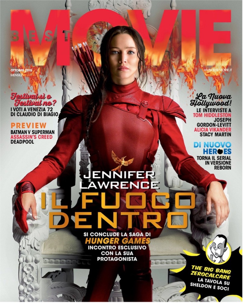
Bonassi M, Best-Movie (2015), 24 September, “IL FUOCO DENTRO”

Web Link –> “Su best movie di ottobre l’intervista a Jennifer Lawrence.” Best Movie. Available at: https://www.bestmovie.it/news/su-best-movie-di-ottobre-lintervista-esclusiva-a-jennifer-lawrence/414414/ (Accessed: October 30, 2022).

HEROES Cover

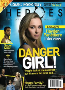
Tv Fanatic, The Official Heroes Magasine (n.d.), "Danger Girl"

Web Link –> TV Fanatic. 2013. Heroes Magazine Cover Girl. [online] Available at: <https://www.tvfanatic.com/gallery/heroes-magazine-cover-girl/> [Accessed 16 October 2022].